GeezerVisonThe World Wide Web, restored to 800 pixels of glory. |
| Home|About|Gaming cabinet|Archives|How it works|Starter sites |
GeezerVison is showing bbc.github.io — GEL Technical Guide: Iconography IconographyIconography aids communication, but should not take precedence over text
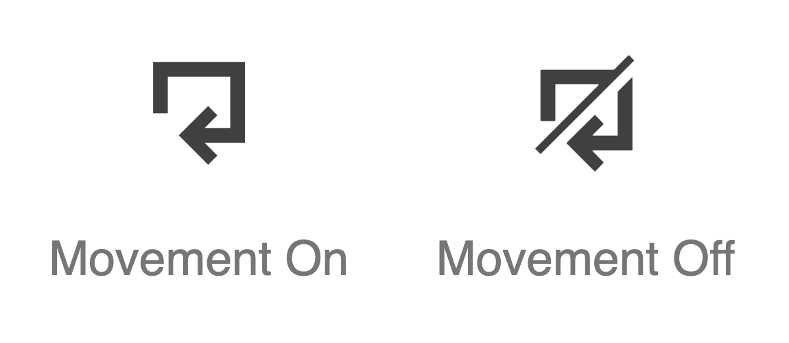
IntroductionText is the primary form of communication on the web, and is highly interoperable. Only use icons where additional clarity is sought. Icons may help those with cognitive impairments, and others who find themselves on a page that isn't in their first language. A comprehensive and standardized set of BBC icons is available. It is not recommended you create your own iconography. Cognition depends heavily on convention, and only by using established iconography can you foster familiarity. Avoid icon fontsThe BBC icons are intended for implementation using inline SVG. Like icon fonts, SVG icons are infinitely scalable without degradation. Unlike SVG, icon fonts icons are mapped to unicode points and interpreted as text. This can have accessibility issues. Most icon font sets map their icons to the unicode Private Use Areas in order to avoid overriding established, meaningful characters and symbols. A problem occurs when users set their own fonts, using an extension or user stylesheet: the icons are replaced with 'missing character' symbols[1]. Dyslexic users sometimes set their own fonts for improved legibility. Icon font icons mapped to established characters are equally problematic. A close icon mapped to an 'A' would reveal itself as an 'A' when the font is overridden. Also, screen readers would interpret and announce the icon as 'A'. Recommended markupIn all cases, icons should accompany either visible or visually hidden text label. The icon itself must take the Only where icons are extremely well-established—such as the play and stop buttons of a media player—is it reliable to use them without supplementary visual text. In these cases, a visually hidden In these instances, hide the label's TooltipsIf the icon has a tooltip, the tooltip can act as the primary label. In the following example, the By default, the tooltip would be hidden using If the tooltip element appears outside the control, associate it to the control element using Recommended layoutSizing and alignmentSizing and alignment for inline text is taken care of by the Note that the ColourThe usual WCAG rules[4] for colour contrast apply to icons, although the impact of icons with inadequate contrast is likely to be less critical than text. As with text, the larger the icon the more minimal the impact of low contrast. There is no good reason, however, to consider low contrast combinations under any circumstances. High Contrast ModeIn Windows High Contrast Mode, the text colour is augmented to become very dark or very light. In order for SVG to adopt the same high contrast colour of the text, use Note that SVG uses Colour independenceControls often exist in changing states: active, disabled etc. It's important these states are not communicated in colour alone, as outlined in WCAG2.1 1.4.1: Use of Color[5]. Otherwise they will not be perceivable to some colour blind users, and others using non-colour displays. The movement icons get around this by using a diagonal line-through style for the "off" state (pictured).
Text decorationThe CTA (Call To Action) links documented under Buttons & CTAs use a Recommended behaviourSVG icons are typically incorporated into interactive elements, which have their own behaviours. For toggle buttons specifically, the icon should help to communicate the state (on or off; open or closed; etc). This can be achieved by either replacing the icon, or augmenting it in some way. The play/pause button documented under Video controls replaces the familiar 'play' triangle with the two vertical lines of 'pause'. Importantly, the textual label (though visually hidden) changes with the corresponding icon to update the state accessibly. At any one time, either the The arrow icon used in the Accordion component faces downwards in the closed/collapsed state, and rotates to point upwards in the open/expanded state. That is, it points in the direction the Accordion item's 'drawer' will go. In the code snippet to follow, the Related researchThis topic does not yet have any related research available. Further reading, elsewhere on the Web
|
| You are visitor 01402503 — GeezerVison does not store the pages you look up. Best viewed with Netscape Navigator 4.7 or Internet Explorer 6 at 800×600. No cookies required. |