GeezerVisonThe World Wide Web, restored to 800 pixels of glory. | ||||||||||||||||||||||||||||||||
| Home|About|Gaming cabinet|Archives|How it works|Starter sites | ||||||||||||||||||||||||||||||||
GeezerVison is showing docs.wxpython.org — wx.RichMessageDialog — wxPython 4.3.2 Docs
|


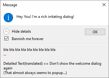
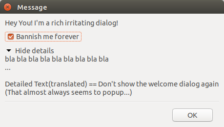

Constructor specifying the rich message dialog properties. |
|
Retrieves the label for the checkbox. |
|
Retrieves the detailed text. |
|
Retrieves the footer icon. |
|
Retrieves the footer text. |
|
Retrieves the state of the checkbox. |
|
Specify the footer icon set together with the footer text. |
|
Shows or hides a footer text that is used at the bottom of the dialog together with an optional icon. |
|
Shows a checkbox with a given label or hides it. |
|
Shows or hides a detailed text and an expander that is used to show or hide the detailed text. |
|
Shows the dialog, returning one of |
 Properties Summary

See |
|
See |
|
See |
|
See |
 Class API

- class wx.RichMessageDialog(GenericMessageDialog)
Possible constructors:
RichMessageDialog(parent, message, caption=MessageBoxCaptionStr,
                  style=OK|CENTRE) -> None
Extension of MessageDialog with additional functionality.
Methods
- __init__(self, parent, message, caption=MessageBoxCaptionStr, style=OK | CENTRE)
Constructor specifying the rich message dialog properties.
Works just like the constructor for wx.MessageDialog.
- Parameters:
parent (wx.Window)
message (string)
caption (string)
style (long)
- Return type:
None
- GetCheckBoxText(self)
Retrieves the label for the checkbox.
- Return type:
str
- Returns:
The label for the checkbox, will be the empty string if no checkbox is used.
- static GetClassDefaultAttributes(variant=WINDOW_VARIANT_NORMAL)
- Parameters:
variant (WindowVariant)
- Return type:
- GetDetailedText(self)
Retrieves the detailed text.
- Return type:
str
- Returns:
The detailed text or empty if detailed text is not used.
- GetFooterIcon(self)
Retrieves the footer icon.
- Return type:
int
- Returns:
The footer icon or 0 if footer icon is not used.
Added in version 4.1/wxWidgets-3.1.1.
See also
- GetFooterText(self)
Retrieves the footer text.
- Return type:
str
- Returns:
The footer text or empty if footer text is not used.
Added in version 4.1/wxWidgets-3.1.1.
- IsCheckBoxChecked(self)
Retrieves the state of the checkbox.
If this method is called before showing the dialog, the initial value of the checkbox, as set by
ShowCheckBoxis used. If it is called after callingwx.Dialog.ShowModal, the value set by the user is returned.- Return type:
bool
- Returns:
Trueif the checkbox is checked orFalseif not.
- SetFooterIcon(self, icon)
Specify the footer icon set together with the footer text.
Valid values are
ICON_INFORMATION,ICON_WARNING,ICON_AUTH_NEEDEDandICON_ERROR(notice thatICON_QUESTIONis not allowed here).- Parameters:
icon (int)
- Return type:
None
Added in version 4.1/wxWidgets-3.1.1.
See also
- SetFooterText(self, footerText)
Shows or hides a footer text that is used at the bottom of the dialog together with an optional icon.
- Parameters:
footerText (string) – The footer text if empty no footer text will be used.
- Return type:
None
Added in version 4.1/wxWidgets-3.1.1.
See also
- ShowCheckBox(self, checkBoxText, checked=False)
Shows a checkbox with a given label or hides it.
- Parameters:
checkBoxText (string) – If the parameter is non-empty a checkbox will be shown with that label, otherwise it will be hidden.
checked (bool) – The initial state of the checkbox.
- Return type:
None
- ShowDetailedText(self, detailedText)
Shows or hides a detailed text and an expander that is used to show or hide the detailed text.
- Parameters:
detailedText (string) – The detailed text that can be expanded when the dialog is shown, if empty no detailed text will be used.
- Return type:
None
- ShowModal(self)
Shows the dialog, returning one of
wx.ID_OK,wx.ID_CANCEL,wx.ID_YES,wx.ID_NO.IsCheckBoxCheckedcan be called afterwards to retrieve the value of the check box if one was used.- Return type:
int
Properties
- CheckBoxText
See
GetCheckBoxText
- DetailedText
See
GetDetailedText
- FooterIcon
See
GetFooterIconandSetFooterIcon
- FooterText
See
GetFooterTextandSetFooterText
Best viewed with Netscape Navigator 4.7 or Internet Explorer 6 at 800×600. No cookies required.