GeezerVisonThe World Wide Web, restored to 800 pixels of glory. | |||||||||||||||||||||||||||||||||||||||||||||||||||||||||||||||||||||||||||||||||||||||||||||||||||||||||||||||||||||||||||||||||||||||||||||||||||||||||||||||||||||||
| Home|About|Gaming cabinet|Archives|How it works|Starter sites | |||||||||||||||||||||||||||||||||||||||||||||||||||||||||||||||||||||||||||||||||||||||||||||||||||||||||||||||||||||||||||||||||||||||||||||||||||||||||||||||||||||||
GeezerVison is showing drafts.csswg.org — CSS Positioned Layout Module Level 3 1. IntroductionThis section is not normative. The CSS layout algorithms, by default, size and position boxes in relation to each other so that nothing overlaps. This specification defines several ways to violate these assumptions when needed, moving elements around in ways that can make them overlap other content:
These positioning schemes, controlled by the position property and the inset properties, are powerful but easy to misuse. With appropriate care, they allow many interesting and useful layouts that couldn’t otherwise be achieved with standard layout rules; without, they allow a page to be laid out in an unusable overlapping jumble of content. 1.1. Module InteractionsThis module replaces and extends the positioning scheme features defined in [CSS2] sections:
It also replaces and supersedes the inset* property definitions in [CSS-LOGICAL-1] (CSS Logical Properties 1 § 4.3 Flow-Relative Offsets: the inset-block-start, inset-block-end, inset-inline-start, inset-inline-end properties and inset-block, inset-inline, and inset shorthands). 1.2. Value DefinitionsThis specification follows the CSS property definition conventions from [CSS2] using the value definition syntax from [CSS-VALUES-3]. Value types not defined in this specification are defined in CSS Values & Units [CSS-VALUES-3]. Combination with other CSS modules may expand the definitions of these value types. In addition to the property-specific values listed in their definitions, all properties defined in this specification also accept the CSS-wide keywords as their property value. For readability they have not been repeated explicitly. 2. Choosing A Positioning Scheme: position property
The position property determines which of the positioning schemes is used to calculate the position of a box. Values other than static make the box a positioned box, and cause it to establish an absolute positioning containing block for its descendants. Values have the following meanings:
A position value of absolute or fixed blockifies the box, causes float to compute to none, and forces the box to establish an independent formatting context. 2.1. Containing Blocks of Positioned BoxesThe containing block of a static, relative, or sticky box is as defined by its formatting context. For fixed and absolute boxes, it is defined as follows:
With no positioning, the containing blocks (C.B.) in the following document:
are established as follows:
If we position "div1": #div1 its containing block is no longer "body"; it becomes the initial containing block (since there are no other positioned ancestor boxes). If we position "em1" as well: #div1 the table of containing blocks becomes:
By positioning "em1", its containing block becomes the nearest positioned ancestor box (i.e., that generated by "div1"). 2.1.1. Further Adjustments to the Containing BlockSome features can alter the effective containing block rectangle of absolutely positioned boxes. These are applied in the following order, with earlier steps modifying the containing block that later steps see:
The element’s original containing block is its containing block before applying any of these effects. 2.2. Painting Order and Stacking ContextsThe z-index property applies to all positioned boxes. When z-index is auto:
Note: The root element always forms a stacking context regardless. See CSS2 § 9.9 Layered presentation and Appendix E: Elaborate description of Stacking Contexts for details about z-index, stacking contexts, and painting order. 3. Positioning CoordinatesThe precise location of a positioned box is controlled by the inset properties: the physical inset properties top, right, bottom, left; the flow-relative inset properties inset-block-start, inset-inline-start, inset-block-end, and inset-inline-end; and their shorthands, inset-block, inset-inline, and inset. The interpretation of these inset properties varies by positioning scheme:
3.1. Box Insets: the top, right, bottom, left, inset-block-start, inset-inline-start, inset-block-end, and inset-inline-end properties
These inset properties represent an inward “inset” on the corresponding side of the box (with respect to the box’s own writing mode; see CSS Writing Modes 3 § 6 Abstract Box Terminology). For example, top represents a downward inset of the top edge. The physical and flow-relative properties interact as defined in [CSS-LOGICAL-1]. Values have the following meanings:
Note: For fixed positioned elements, using large values or negative values can easily move elements outside the viewport and make the contents unreachable through scrolling or other means. 3.2. Box Insets Shorthands: the inset-block, inset-inline, and inset properties
The inset-block and inset-inline properties are shorthand properties for setting inset-block-start + inset-block-end or inset-inline-start + inset-inline-end, respectively, in a single declaration. The first component value sets the start side, the second sets the end; if omitted, the second value defaults to the first.
The inset property is a shorthand property that sets all of the inset properties in a single declaration, assigning values to the longhands representing each side exactly as the margin property does for its longhands. By default, the inset property values are assigned to the corresponding physical longhand properties—top, right, bottom, and left—which for historical reasons do not have an inset- prefix. This matches the behavior of other "4 values assigned to sides" properties, such as margin. Allowing properties such as this to resolve to the flow-relative longhands is under discussion in [CSS-LOGICAL-1]. Yes, we understand it’s a little confusing that inset doesn’t expand to any inset-* properties. 3.3. Relative PositioningFor a relatively positioned box, the inset properties move the box inward from the respective edge, without changing its size. left moves the box to the right, right moves it to the left, etc. Since boxes are not split or stretched as a result of relative positioning opposing used values in a given axis must be negations of each other:
The following three rules are equivalent, and shift the box 1em to the left: div.a8 If specified on a table-row-group, table-header-group, table-footer-group, or table-row box the shift affects all the contents of the box, including all table cells that originate in the affected row, but not those that don’t. Note: Since position does not apply to table-column-group or table-column boxes, they are not affected by relative positioning. 3.4. Sticky positioningSticky positioning is similar to relative positioning except the offsets are automatically calculated in reference to the nearest scrollport. For a sticky positioned box, the inset properties represent insets from the respective edges of the scrollport of the nearest scroll container with a matching scrollable axis, defining the sticky view rectangle used to constrain the box’s position. (The sticky view rectangle can be constructed from edges of two different scrollports, if the nearest scroll container is a single-axis scroll container.) If both inset properties in a given axis are auto, no offsets are added in that axis; the element stays where it was laid out in that axis. Otherwise, auto insets represent zero insets. If this results in a sticky view rectangle size in any axis less than the size of the border box of the sticky box in that axis, then the effective end-edge inset in the affected axis is reduced (possibly becoming negative) to bring the sticky view rectangle’s size up to the size of the border box in that axis (where end is interpreted relative to the writing mode of the containing block).
For example,
if the nearest scrollport is 300px tall,
the sticky box’s border box is 200px tall,
and it has top: 20px,
then the top-edge inset of the nearest scrollport is 20px,
and the bottom-edge inset is 0px,
yielding a sticky view rectangle that is 280px tall.
But if the nearest scrollport were only 100px tall, then the effective bottom-edge inset becomes -120px, resulting in a sticky view rectangle that’s 200px tall, enough to fully contain the margin box of the sticky box. For each side of the box, if the corresponding inset property is not auto, and the corresponding border edge of the box would be outside the corresponding edge of the sticky view rectangle, then the box must be visually shifted (as for relative positioning) to be inward of that sticky view rectangle edge, insofar as it can while its position box remains contained within its containing block. The position box is its margin box, except that for any side for which the distance between its margin edge and the corresponding edge of its containing block is less than its corresponding margin, that distance is used in place of that margin. Note: A sticky positioned element with a non-auto top value and an auto bottom value will only ever be pushed down by sticky positioning; it will never be offset upwards. Note: Multiple sticky positioned boxes in the same container are offset independently, and therefore might overlap. 3.4.1. Scroll Position of Sticky-Positioned BoxesFor the purposes of any operation targeting the scroll position of a sticky positioned element (or one of its descendants), the sticky positioned element must be considered to be at its offsetted position.
For example, if a user clicks a link targeting a sticky-positioned element,
if the element’s nearest scrollport is currently scrolled
such that the sticky positioned element is offset from its initial position,
the scroll container will be scrolled back
only the minimum necessary to bring it into its desired position in the scrollport
(rather than scrolling all the way back
to target its original, non-offsetted position).
3.5. Absolute (and Fixed) PositioningFor an absolutely positioned box, the inset properties effectively reduce the containing block into which it is sized and positioned by the specified amounts. The resulting rectangle is called the inset-modified containing block. (For disambiguation, the actual containing block of an absolutely positioned box can also be called the absolute-position containing block.) An absolutely positioned box is sized and positioned into the inset-modified containing block as described in § 4 Absolute Positioning Layout Model. 3.5.1. Resolving auto InsetsIf only one inset property in a given axis is auto, it is set to zero. If both inset properties in a given axis are auto, then, depending on the box’s self-alignment property in the relevant axis:
For the rules above, ignore overflow alignment, and treat normal as start and any baseline or stretch alignment value as its fallback alignment. 3.5.2. Resolving Overconstrained InsetsIf the inset-modified containing block size in any axis is less than zero, then the weaker inset in the affected axis is reduced (possibly becoming negative) to bring that size up to zero. In the case that only one inset is auto, that is the weaker inset (whose opposite inset is the stronger inset); otherwise the weaker inset is the inset of the end edge (where end is interpreted relative to the writing mode of the containing block). If its self-alignment property in an axis is normal, then the resolved value of its weaker inset in that axis is the value necessary to match that edge of its inset-modified containing block to the corresponding edge of its margin box after layout. (Otherwise the resolved value is the used value described above.) 3.5.3. Calculating the Static Position and the “Static-Position Rectangle”When both inset properties in a given axis are auto, they are resolved into a static position by aligning the box into its static-position rectangle, an alignment container derived from the formatting context the box would have participated in if it were position: static (independent of its actual containing block). The static position represents an approximation of the position the box would have had if it were position: static.
Finding the static position and the static-position rectangle assumes that both float and clear (as well as position) have their initial values, and can consequently require assuming a different hypothetical value for display as well. (The containing block the element would have had under these conditions is the static-position containing block.) To the extent the box alignment properties have an effect, they use the static-position containing block as the effective containing block, including using its writing mode for resolving alignment axes and directions. Additionally, the containing block of fixed positioned elements is assumed to be the initial containing block instead of the viewport, and all scroll containers should be assumed to be scrolled to their initial scroll position. Lastly, all auto margins on the box itself are treated as zero. Boxes in the top layer always use the initial containing block as their static-position rectangle. 4. Absolute Positioning Layout ModelAbsolute positioning not only takes a box out of flow, but also lays it out in its containing block (after the final size of the containing block has been determined) according to the absolute positioning layout model:
4.1. Automatic Sizes of Absolutely-Positioned BoxesThe automatic size of an absolutely positioned box is resolved against its inset-modified containing block as follows:
However, if the box has an aspect-ratio, then an automatic size in the ratio-dependent axis is instead resolved as a max-content size. When both axes have an automatic size, if only one axis has an auto inset then that axis is the ratio-dependent axis, else the block axis is the ratio-dependent axis. An automatic size in the ratio-determining axis is determined as above. For the purpose of computing these sizes, any auto margins are treated as zero. The automatic minimum size of an absolutely-positioned box is always zero. Note: To the extent that form controls can be resized
(and are not directly representing replaced elements such as images),
they are expected to be treated as non-replaced here.
In HTML, all form controls
other than 4.2. Auto Margins of Absolutely-Positioned BoxesIf either inset property in the relevant axis is auto, then any auto margins resolve to zero. Otherwise, the remaining space is calculated as the size of its inset-modified containing block in the relevant axis minus the box’s used size in the relevant axis, and this remaining space is divided among any auto margins in the relevant axis. However, (all with respect to the writing mode of the containing block), if in the inline axis the remaining space is negative and both margins are auto, the start margin resolves to zero and the end margin receives the remaining space. Note: Unlike typical in-flow layout, the space distributed to auto margins can be negative in absolute positioning. What should happen in “negatively-sized” containing blocks? CSS2.1 and this draft currently conflict. [Issue #11478] 4.3. Self-Alignment of Absolutely Positioned BoxesIf the computed value of either inset property in an axis is auto, then its margin box is aligned to the edge of the inset-modified containing block corresponding to its stronger inset (even if this would overflow its containing block). Otherwise, if either margin is auto, its position is resolved according to § 4.2 Auto Margins of Absolutely-Positioned Boxes. Otherwise, the box is aligned as specified by its self-alignment property in the relevant axis (as defined by the writing mode of the containing block), using its margin box as the alignment subject and the inset-modified containing block as the alignment container. However, if an explicit overflow alignment is not specified and its margin box overflows the inset-modified containing block, its alignment is adjusted to minimize overflow as specified in CSS Box Alignment 3 § 4.4.1.2 Self-Alignment for Absolutely Positioned Boxes. 4.4. Fragmenting Absolutely-positioned ElementsIn a fragmented flow, an absolutely positioned box is positioned relative to its containing block ignoring any fragmentation breaks (as if the flow were continuous). The box may subsequently be broken over several fragmentation containers. For absolutely positioned content in paged media that resolves to a position on a page other than the page being laid out (the current page), or resolves to a position on the current page that has already been rendered for printing, printers may place the content:
Note: A block-level element that is split over several pages can have a different width on each page, and there may be device-specific limits. User agents must not paginate the content of fixed-positioned boxes. Note: User agents might print invisible content in other ways. See CSS Paged Media 3 § 3.2 Content outside the page box. 5. Old Absolute Positioning Layout ModelThis section is being replaced with the new § 4 Absolute Positioning Layout Model section. It is preserved here for comparison: both models should yield the same result in horizontal writing modes when the box’s self-alignment is normal. 5.1. The Width of Absolutely-Positioned, Non-Replaced ElementsThe constraint that determines the used values for these elements is:
If all three of left, width, and right are auto: First set any auto values for margin-left and margin-right to 0. Then, if the direction property of the element establishing the static-position containing block is ltr set left to the static position and apply rule number three below; otherwise, set right to the static-position and apply rule number one below. If none of the three is auto: If both margin-left and margin-right are auto, solve the equation under the extra constraint that the two margins get equal values, unless this would make them negative, in which case when direction of the containing block is ltr (rtl), set margin-left (margin-right) to 0 and solve for margin-right (margin-left). If one of margin-left or margin-right is auto, solve the equation for that value. If the values are over-constrained, ignore the value for left (in case the direction property of the containing block is rtl) or right (in case direction is ltr) and solve for that value. Otherwise, set auto values for margin-left and margin-right to 0, and pick one of the following six rules that apply.
5.2. The width of absolute or fixed positioned, replaced elementsIf height and width both have computed values of auto and the element also has an intrinsic width, then that intrinsic width is the used value of width. If height and width both have computed values of auto and the element has no intrinsic width, but does have an intrinsic height and intrinsic ratio; or if width has a computed value of auto, height has some other computed value, and the element does have an intrinsic ratio; then the used value of width is:
If height and width both have computed values of auto, the element has an intrinsic ratio but no intrinsic height or width, and the containing block’s width does not itself depend on the replaced element’s width, then the used value of width is calculated from the constraint equation used for block-level, non-replaced elements in normal flow. Otherwise, if width has a computed value of auto, and the element has an intrinsic width, then that intrinsic width is the used value of width. Otherwise, if width has a computed value of auto, but none of the conditions above are met, and then the used value of width becomes 300px. If 300px is too wide to fit the device, user agents should use the width of the largest rectangle that has a 2:1 ratio and fits the device instead. After establishing the width, in order to position the replaced element, apply the following rules as appropriate.
5.3. The Height Of Absolutely Positioned, Non-Replaced ElementsFor absolutely positioned elements, the used values of the vertical dimensions must satisfy this constraint:
If all three of top, height, and bottom are auto: First set any auto values for margin-top and margin-bottom to 0, then set top to the static position, and finally apply rule number three below. If none of the three are auto: If both margin-top and margin-bottom are auto, solve the equation under the extra constraint that the two margins get equal values. If one of margin-top or margin-bottom is auto, solve the equation for that value. If the values are over-constrained, ignore the value for bottom and solve for that value. Otherwise, set auto values for margin-top and margin-bottom to 0, and pick one of the following six rules that apply.
5.4. The Height Of Absolutely Positioned, Replaced ElementsIf height and width both have computed values of auto and the element also has an intrinsic height, then that intrinsic height is the used value of height. Otherwise, if height has a computed value of auto and the element has an intrinsic ratio then the used value of height is:
Otherwise, if height has a computed value of auto and the element has an intrinsic height, then that intrinsic height is the used value of height. Otherwise, if height has a computed value of auto, but none of the conditions above are met, then the used value of height must be set to the height of the largest rectangle that has a 2:1 ratio, has a height not greater than 150px, and has a width not greater than the device width. After establishing the height, in order to position the replaced element, apply the following rules as appropriate.
6. Informative Comparison of Normal Flow, Floats, and PositioningThis section is not normative. To illustrate the differences between normal flow, relative positioning, floats, and absolute positioning, we provide a series of examples based on the following HTML:
The final positions of boxes generated by the outer and inner elements vary in each example. In each illustration, the numbers to the left of the illustration indicate the normal flow position of the double-spaced (for clarity) lines. Note: The diagrams in this section are illustrative and not to scale. They are meant to highlight the differences between the various positioning schemes, and are not intended to be reference renderings of the examples given. 6.1. Normal Flow ExampleConsider the following CSS declarations for outer and inner that do not alter the normal flow of boxes: The P element contains all inline content: anonymous inline text and two SPAN elements. Therefore, all of the content will be laid out in an inline formatting context, within a containing block established by the P element, producing something like: 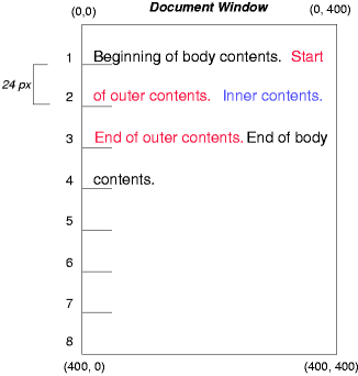
6.2. Relative Positioning ExampleTo see the effect of relative positioning, we specify: #outer Text flows normally up to the outer element. The outer text is then flowed into its normal flow position and dimensions at the end of line 1. Then, the inline boxes containing the text (distributed over three lines) are shifted as a unit by -12px (upwards). The contents of inner, as a child of outer, would normally flow immediately after the words "of outer contents" (on line 1.5). However, the inner contents are themselves offset relative to the outer contents by 12px (downwards), back to their original position on line 2. Note that the content following outer is not affected by the relative positioning of outer. 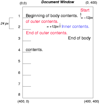
Note also that had the offset of outer been -24px, the text of outer and the body text would have overlapped. 6.3. Floating ExampleNow consider the effect of floating the inner element’s text to the right by means of the following rules: Text flows normally up to the inner box, which is pulled out of the flow and floated to the right margin (its width has been assigned explicitly). Line boxes to the left of the float are shortened, and the document’s remaining text flows into them. 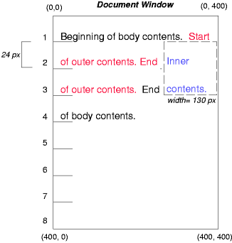
To show the effect of the clear property, we add a sibling element to the example:
These styles cause the inner box to float to the right, as before, and the document’s remaining text to flow into the vacated space: 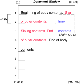
However, if the clear property on the sibling element is set to right (i.e., the generated sibling box will not accept a position next to floating boxes to its right), the sibling content begins to flow below the float: 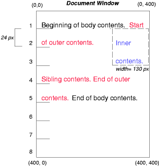
6.4. Absolute Positioning ExampleNext, we consider the effect of absolute positioning. Consider the following CSS declarations for outer and inner: #outer which cause the top of the outer box to be positioned with respect to its containing block. The containing block for a positioned box is established by the nearest positioned ancestor (or, if none exists, the initial containing block, as in our example). The top side of the outer box is 200px below the top of the containing block and the left side is 200px from the left side. The child box of outer is flowed normally with respect to its parent. 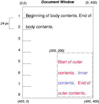
The following example shows an absolutely positioned box that is a child of a relatively positioned box. Although the parent outer box is not actually offset, setting its position property to relative means that its box may serve as the containing block for positioned descendants. Since the outer box is an inline box that is split across several lines, the first inline box’s top and left edges (depicted by thick dashed lines in the illustration below) serve as references for top and left offsets. #outer This results in something like the following: 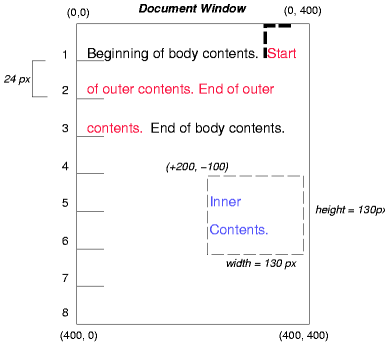
If we do not position the outer box: #outer the containing block for inner becomes the initial containing block (in our example). The following illustration shows where the inner box would end up in this case. 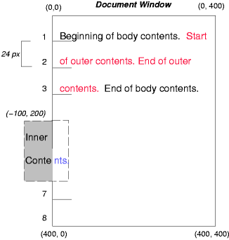
Relative and absolute positioning may be used to implement change bars, as shown in the following example. The following fragment:
might result in something like: 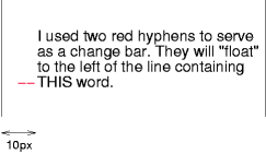
First, the paragraph (whose containing block sides are shown in the illustration) is flowed normally. Then it is offset 10px from the left edge of the containing block (thus, a right margin of 10px has been reserved in anticipation of the offset). The two hyphens acting as change bars are taken out of the flow and positioned at the current line (due to 'top: auto'), -1em from the left edge of its containing block (established by the P in its final position). The result is that the change bars seem to "float" to the left of the current line. 7. AcknowledgmentsThis module would not have been possible without input and support from many helpful people. Thanks to Rossen Atanassov, Bert Bos, Oriol Brufau, Tantek Çelik, Arron Eicholz Sylvain Galineau, John Jansen, Chris Jones, Ian Kilpatrick, Anton Prowse. ChangesSignificant changes since the 7 October 2025 Working Draft:
Significant changes since the 11 March 2025 Working Draft:
See also Previous Changes. Privacy ConsiderationsThis specification introduces no new privacy considerations. Security ConsiderationsIf an attacker is able to inject arbitrary CSS, positioned layout can make it easier to position elements the attacker has control of over arbitrary other elements of the page, potentially tricking users of the page. (There are many routes to this attack: negative margin, transform, etc. Don’t let people apply arbitrary CSS to bits of your page.) position: fixed can allow a page to emulate modal dialogs, potentially tricking a user into thinking they’re interacting with the user agent and entering in sensitive information that they page can then capture. User agents must ensure that their native dialogs are positioned in ways that the page cannot emulate; in particular, that at least some of the dialog is outside the "poisoned pixels" that web content can paint to. | |||||||||||||||||||||||||||||||||||||||||||||||||||||||||||||||||||||||||||||||||||||||||||||||||||||||||||||||||||||||||||||||||||||||||||||||||||||||||||||||||||||||
| You are visitor 01402503 — GeezerVison does not store the pages you look up. Best viewed with Netscape Navigator 4.7 or Internet Explorer 6 at 800×600. No cookies required. | |||||||||||||||||||||||||||||||||||||||||||||||||||||||||||||||||||||||||||||||||||||||||||||||||||||||||||||||||||||||||||||||||||||||||||||||||||||||||||||||||||||||