GeezerVisonThe World Wide Web, restored to 800 pixels of glory. |
| Home|About|Gaming cabinet|Archives|How it works|Starter sites |
GeezerVison is showing drafts.csswg.org — CSS Pseudo-Elements Module Level 4 1. IntroductionThis section is informative. Pseudo-elements represent abstract elements of the document beyond those elements explicitly created by the document language. Since they are not restricted to fitting into the document tree, they can be used to select and style portions of the document that do not necessarily map to the document’s tree structure. For instance, the ::first-line pseudo-element can select content on the first formatted line of an element after text wrapping, allowing just that line to be styled differently from the rest of the paragraph. Each pseudo-element is associated with an originating element and has syntax of the form ::name-of-pseudo. This module defines the pseudo-elements that exist in CSS and how they can be styled. For more information on pseudo-elements in general, and on their syntax and interaction with other selectors, see [SELECTORS-4]. Note: As a reminder, pseudo-elements cannot be chained together unless explicitly allowed. For example, ::marker::before is not allowed; but ::before::marker is. Note: Level 4 is the first version of the CSS Pseudo specification under this name. It was branched from the Selectors 3 [SELECTORS-3] specification, and thus started at level 4, with the remainder of Selectors 3 becoming Selectors 4 [SELECTORS-4]. 2. Typographic Pseudo-elements2.1. First-Line Text: the ::first-line pseudo-elementThe ::first-line pseudo-element represents the contents of the first formatted line of its originating element. Tests
The rule below means
“change the letters of the first line of every
p element to uppercase”:
The selector p::first-line
does not match any real document element.
It instead matches a pseudo-element
that the user agent will automatically insert
at the beginning of every Note: Note that the length of the first line depends on a number of factors, including the width of the page, the font size, etc.
For example, given an ordinary HTML [HTML5] paragraph such as:
Depending on the width of the element, its lines might be broken as follows: THIS IS A SOMEWHAT LONG HTML PARAGRAPH THAT will be broken into several lines. The first line will be styled by the ‘::first-line’ pseudo-element. The other lines will be treated as ordinary lines in the paragraph. or alternately as follows: THIS IS A SOMEWHAT LONG HTML paragraph that will be broken into several lines. The first line will be styled by the ‘::first-line’ pseudo- element. The other lines will be treated as ordinary lines in the paragraph. 2.1.1. Finding the First Formatted LineIn CSS, the ::first-line pseudo-element can only have an effect when attached to a block container:
Note: The first formatted line can be an empty line.
For example, the first line of the Note: The first line of a block container
that does not itself participate in a block formatting context
cannot be the first formatted line of an ancestor element.
Thus, in When a first formatted line is represented by multiple ::first-line pseudo-elements, they are nested in the same order as their originating elements. The inline-level contents of this line—including its root inline box fragment—are nested within the innermost ::first-line pseudo-element. Tests
Consider the following markup:
If we assume a fictional tag sequence to represent the elements’ ::first-line pseudo-elements, it would be something like:
2.1.2. Styling the ::first-line Pseudo-elementThe ::first-line pseudo-element’s generated box behaves similar to that of an inline-level box, but with certain restrictions. The following CSS properties apply to a ::first-line pseudo-element:
User agents may apply other properties as well except for the following excluded properties: Note: Setting line-height on ::first-line inherits to the fragment of the root inline box that wraps the contents of the first line, and therefore can both increase and decrease the height of the first line box. 2.1.3. Inheritance and the ::first-line Pseudo-elementDuring CSS inheritance, the fragment of a child that occurs on the first line inherits any standard inherited properties—except the properties excluded above—from the ::first-line pseudo-element. For all other properties, including all custom properties [CSS-VARIABLES-1], inheritance is from the non-pseudo parent. (The portion of a child element that does not occur on the first line always inherits from the non-pseudo parent.)
In the common case (of standard inherited CSS properties),
inheritance into and from a ::first-line pseudo-element
can be understood by writing out a fictional tag sequence
to represent ::first-line.
Consider the earlier example;
in case of the first rendering, the fictional tag sequence would be:
And in the case of the second rendering:
If a pseudo-element breaks up a real element,
the effect can often be described
by a fictional tag sequence
that closes and then re-opens the element.
Suppose we mark up the earlier example
with a
span element encompassing the first sentence:
The effect of the first rendering would be similar to the following fictional tag sequence:
2.2. First-Letter Text: ::first-letter pseudo-element and its ::prefix and ::suffix childrenTests
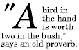
The ::first-letter pseudo-element represents
the first Letter, Number, or Symbol
(Unicode category
For example, the following rule creates a 2-line drop-letter
on every paragraph following a level-2 header,
using the initial-letter property defined in [CSS-INLINE-3]:
h2 + p::first-letter Note: The first letter may in fact be a digit, e.g., the “6” in “67 million dollars is a lot of money.” To allow independent styling of the first letter itself and its adjacent punctuation, associated preceding punctuation is represented by the ::prefix sub-pseudo-element of the ::first-letter pseudo-element (::first-letter::prefix); and associated following punctuation is represented by the ::suffix sub-pseudo-element of the ::first-letter pseudo-element (::first-letter::suffix). See § 2.2.1 First Letters and Associated Punctuation, below. 2.2.1. First Letters and Associated PunctuationAs explained in CSS Text 3 § 1.4 Characters and Letters, a typographic character unit can include more than one Unicode codepoint. For example, combining characters must be kept with their base character. Also, languages may have additional rules about how to treat certain letter combinations. In Dutch, for example, if the letter combination "ij" appears at the beginning of an element, both letters should be considered within the ::first-letter pseudo-element. [UAX29] When selecting the first letter, the UA should tailor its definition of typographic character unit to reflect the first-letter traditions of the ::first-letter pseudo-element’s containing block’s content language. Preceding and following punctuation must also be included as part of the first-letter text in the ::first-letter pseudo-element as follows:
Informally, the first-letter text’s pattern here
can be roughly
(ignoring the exclusions from
Zs)
represented as a “regular expression”
(P (Zs|P)*)? (L|N|S) ((Zs|P−(Ps|Pd))* (P−(Ps|Pd))?—or, alternatively,
([P] [Zs P]*)? [L N S] ([Zs [P--[Ps Pd]]]* [P--[Ps Pd]])?—where the Unicode category abbreviation represents the set
of all typographic character units belonging to that category.
See CSS Text 3 § 1.4 Characters and Letters and CSS Text 3 § E Characters and Properties for more information on typographic character units and their Unicode properties. [CSS-TEXT-3] 2.2.2. Finding the First-Letter TextAs with ::first-line, the ::first-letter pseudo-element can only have an effect when attached to a block container. Its first-letter text is the first such inline-level content participating in the inline formatting context of its originating element’s first formatted line, if it is not preceded by any other in-flow content (such as images or inline tables) on its line. For this purpose, any marker boxes are ignored, as if they were out-of-flow. However, if an element has in-flow ::before or ::after content, the first-letter text is selected from the content of the element including that generated content.
Example:
After the rule
If no qualifying text exists, then there is no first-letter text and no ::first-letter pseudo-element. Note: When the first formatted line is empty,
::first-letter will not match anything.
For example, in this HTML fragment:
Note: As with ::first-line,
the first-letter text of a block container
that does not participate in a block formatting context
cannot be the first-letter text of an ancestor element.
Thus, in Any portion of the first-letter text that is wrapped to the next line no longer forms part of the ::first-letter pseudo-element. 2.2.3. Inheritance and Box Tree Structure of the First-Letter Pseudo-elementsThe ::first-letter pseudo-element is wrapped immediately around the first-letter text it represents, even if that text is in a descendant. When a first-letter text is represented by multiple ::first-letter pseudo-elements, they are nested in the same order as their originating elements. Inheritance behaves accordingly.
Consider the following markup:
If we assume a fictional tag sequence to represent the elements’ ::first-letter pseudo-elements, it would be something like: <div> <p><span><div::first-letter><p::first-letter>T</…></…>he first few words</span> and the rest of the paragraph. </div> If any ::first-letter::prefix or ::first-letter::suffix pseudo-elements exist, they are nested within the innermost ::first-letter, and otherwise interpreted similar to ::first-letter itself.
Consider the following markup:
If we assume a fictional tag sequence to represent the elements’ ::first-letter pseudo-elements, it would be something like: <div> <p><span><div::first-letter><p::first-letter><div::first-letter::prefix><p::first-letter::prefix>“</…></…>T</…></…>he first few words</span> and the rest of the paragraph. </div> If the characters that would form the first-letter text
are not all in the same element
(as the A ::first-letter pseudo-element is contained within any ::first-line pseudo-elements, and thus inherits (potentially indirectly) from ::first-line, the same as any inline box on the same line. 2.2.4. Styling the First-Letter Pseudo-elementsIn CSS a ::first-letter pseudo-element (and its ::prefix and ::suffix sub-elements) is similar to an inline box. The following properties apply to ::first-letter, ::first-letter::prefix, and ::first-letter::suffix pseudo-elements:
User agents may apply other properties as well. However, in no case may the application of such unlisted properties to ::first-letter change what first-letter text is represented by that ::first-letter. Note: In previous levels of CSS, user agents were allowed to choose a line height, width, and height based on the shape of the letter, to approximate font sizes; and to take the glyph outline into account when performing layout. The possibility of such loosely-defined magic has been intentionally removed, as it proved to be a poor solution for the intended use case (drop caps and raised caps), yet caused interoperability problems. See initial-letter in [CSS-INLINE-3] for explicitly handling drop caps and raised caps. 3. Highlight Pseudo-elements3.1. Selecting Highlighted Content: the ::selection, ::search-text, ::target-text, ::spelling-error, ::grammar-error, and ::highlight() pseudo-elementsTests
The highlight pseudo-elements represent portions of a document that have been given a particular status and are typically styled differently to indicate that status to the user. For example, selected portions of the document are typically highlighted (given alternate background and foreground colors, or a color wash) to indicate their selected status. The following highlight pseudo-elements are defined:
The highlight pseudo-elements do not necessarily fit into the element tree, and can arbitrarily cross element boundaries without honoring its nesting structure. 3.2. Styling HighlightsThe highlight pseudo-elements can only be styled by a limited set of properties that do not affect layout and can be applied performantly in a highly dynamic environment—and additionally (to ensure interoperability) whose rendering within the required area is not dependent on the exact (UA-determined) bounds of the highlight overlay. The following properties apply to the highlight pseudo-elements:
Are there any other properties that should be included here? Note: Historically (and at the time of writing) only color and background-color have been interoperably supported. Note: The color property sets the color of both the text and all line decorations (underline, overline, line-through) and emphasis marks (text-emphasis) applied to the text by the originating element and its ancestors and descendants. For any properties not listed above, but which are required to resolve the values of applicable properties, their computed values are copied from those of the originating element, ignoring any values specified on the highlight pseudo-element itself. For example:
If, for a given highlight pseudo-element, there are colors specified in the author origin, those colors must be respected as specified; i.e. the UA must not apply any extra processing (such as using semi-transparent washes). However if there are no colors in the author origin, the UA may apply additional color processing. Note: This is to ensure that color contrast is preserved across all user agents interpreting a given author stylesheet. Vendor-prefixed properties such as -webkit-text-fill-color are not applicable to the highlight pseudo-elements. 3.3. Default UA StylesThe following additions are recommended for the default UA stylesheet:
Some highlight pseudo-elements should have paired default highlight colors—a default color and background-color provided by the UA that are either used or overridden together, see § 3.3.1 Paired Defaults. For ::selection they should correspond to HighlightText and Highlight, while for ::target-text they should correspond to MarkText and Mark. UAs may apply additional effects to enhance the presentation of highlighted content, for example dimming content other than the highlighted text or transitioning out a highlight style based on user interactions or timing. These are not controlled by CSS. UA tweaks to the presentation of highlights in ways that are controlled by CSS are currently under discussion in Issue 6853. 3.3.1. Paired DefaultsFor compatibility reasons, paired default highlight colors must only be used when neither color nor background-color yield a cascaded value from the author origin (or inherit their value from the author origin). When a highlight color is revert or revert-layer, the origin after rolling back the cascade determines the cascaded value’s origin. Note: Because this rule is for compatibility reasons, it does not apply to other similar properties like fill-color or stroke-color.
For example,
given the following markup:
Any of the following rules would suppress the default background-color for ::selection in the <em> element
if given by the author:
Tests
3.4. Area of a HighlightFor each type of highlighting (see § 3.1 Selecting Highlighted Content: the ::selection, ::search-text, ::target-text, ::spelling-error, ::grammar-error, and ::highlight() pseudo-elements) there exists a single highlight overlay for the entire document, the active portions of which are represented by the corresponding highlight pseudo-element. Each box owns the piece of the overlay corresponding to any text or replaced content directly contained by the box.
See F2F minutes, dbaron’s message, Daniel’s thread, Gecko notes, Opera notes, Webkit notes Not sure if this is the correct way of describing the way things work. 3.5. Cascading and Per-Element Highlight StylesEach element draws its own active portions of the highlight overlays, which receives the styles specified by the corresponding highlight pseudo-element styles for which that element is the originating element. When multiple styles conflict, the winning style is determined by the cascade. When any supported property is not given a value by the cascade, or given a value of inherit or unset, its specified value is determined by inheritance from the corresponding highlight pseudo-element of its originating element’s parent element. This occurs regardless of whether that property is an inherited property. Additionally, for highlight pseudo-elements originating from the root element the inherited value of color is currentColor, not the initial value. All custom properties inherit from the originating element, regardless of whether that property is a custom property that is registered to inherit or not. Tests
For example, if the following rules were applied:
to the following markup: The selection highlight would be green throughout, with yellow text outside the <em> element
and orange text inside it.
Authors wanting multiple selections styles should use :root::selection for their document-wide selection style, since this will allow clean overriding in descendants. ::selection alone applies to every element in the tree, overriding the more specific styles of any ancestors.
For example, if an author specified
::selectionand the document included The highlight would be blue over “very important information” because the <strong> element´s ::selection
also matches the ::selection { background: blue; } rule.
(Remember that * is implied when a tag selector is missing.)
The style rules that would give the intended behavior
(red highlight within p.warning, blue elsewhere) are
:root::selection The following example demonstrates the inheritance of custom properties.
For example, if an author specified
:rootThe universal ::selection uses the user-agent’s default styling because it only defines custom properties, with no properties that influence the appearance. A div’s selection highlight would apply a green background to the selected content, with a 10px thick blue underline. Since --background-color and --decoration-thickness custom properties are not specified on the div::selection peudo-element, they are inherited from its originating div element,
which itself inherits the custom properties from the root.
However since --decoration-color is specified on the div::selection itself,
its value from the originating element is not used.
Note: This behavior allows control of selection with custom properties in a way that is compatible with pre-existing implementations. 3.6. Painting the HighlightTests
3.6.1. BackgroundsEach highlight pseudo-element draws its background over the corresponding portion of the highlight overlay, painting it immediately below any positioned descendants (i.e. just before step 8 in CSS2.2§E.2). The ::selection overlay is drawn over the ::target-text overlay which is drawn over the ::spelling-error overlay which is drawn over the ::grammar-error overlay which is drawn over the ::highlight overlays. The ::search-text overlay is drawn directly over or below the :selection overlay depending on the UA, and drawn over all other overlays. Tests3.6.2. ShadowsAny text-shadow applying to a highlight pseudo-element is drawn over its corresponding highlight overlay background. Such text shadows also stack over each other (and over any original text-shadow applied to the text and its decorations, which continues to apply). Note: Since each highlight overlay background is drawn over any shadows belonging to the layer(s) below, a highlight overlay background can obscure lower-level shadows. 3.6.3. Text and Text DecorationsA highlight pseudo-element suppresses the normal drawing of any associated text, and the text decorations (other than shadows) that had been applied to that text. Instead the topmost active highlight overlay redraws that text (and those decorations) over all the highlight overlay backgrounds using that highlight’s own color. Note: This means that unlike shadows, line decorations and emphasis marks won’t be obscured by any highlight overlay backgrounds that are drawn for the associated text. For this purpose, currentColor on a highlight pseudo-element’s color property represents the color of the next active highlight pseudo-element layer below, falling back finally to the colors that would otherwise have been used (those applied by the originating element or an intervening pseudo-element such as ::first-line or ::first-letter). Note: The element’s own text decorations (both line decorations and emphasis marks) are thus drawn in the pseudo-element’s own color when that is not currentColor, regardless of their original color or fill specifications. Any text decorations introduced by each highlight pseudo-element are stacked in the same order as their backgrounds over the text’s original decorations and are all drawn, each decoration in its own color. The normal painting order applies, so as per CSS2 Appendix E, all underlines are drawn below overlines which are drawn below the text which is drawn below any line-throughs. However, text decorations applied by ::selection may instead all be drawn along with the text as a topmost set of layers above all other decorations.
For example, assuming the original text has an underline and a strike-through,
that ::selection applies an underline
and ::target-text applies both overline and strike-through,
the following are both conformant painting orders:
Line decorations introduced by highlight pseudo-elements apply only to the text associated with their originating element, and are not propagated to descendants except via property inheritance (as described above). Note: Unlike the originating element’s own decorations, decorations declared on a highlight pseudo-element propagate to out-of-flow elements and inline blocks, with thickness and position varying between descendants. Tests3.6.4. Replaced ElementsFor non-replaced content, the UA must honor the color and background-color (including their alpha channels) as specified. However, for replaced content, the UA should create a semi-transparent wash to coat the content so that it can show through the selection. This wash should be of the specified background-color if that is not transparent, else of the specified color; however the UA may adjust the alpha channel. 3.7. Security Considerations for HighlightingBecause the styling of spelling and grammar errors can leak information about the contents of a user’s dictionary (which can include the user’s name and even includes the contents of their address book!) UAs that implement ::spelling-error and ::grammar-error must mitigate the following attacks:
4. Tree-Abiding Pseudo-elementsTree-abiding pseudo-elements always fit within the box tree. They inherit any inheritable properties from their originating element; non-inheritable properties take their initial values as usual. [CSS-CASCADE-4] A subset of these are the fully styleable pseudo-elements; all properties that apply to a real element also apply to a fully styleable pseudo-element. 4.1. Generated Content Pseudo-elements: ::before and ::afterWhen their computed content value is not none, these pseudo-elements generate boxes as if they were immediate children of their originating element, with content as specified by content.
Tests
Both ::before and ::after are fully styleable pseudo-elements: there is no restriction on what properties apply to them.
For example, the following rule inserts the string “Note: ”
before the content of every
<p> element
whose class attribute has the value note:
p.note::before Since the initial value of display is inline,
this will generate an inline box.
Like other inline children of As with the content of regular elements, the generated content of ::before and :after pseudo-elements can form part of any ::first-line and ::first-letter pseudo-elements applied to its originating element. Also as with regular child elements, the ::before and ::after pseudo-elements are suppressed when their parent, the originating element, is replaced. 4.2. List Markers: the ::marker pseudo-elementThe ::marker pseudo-element represents the automatically generated marker box of a list item. (See [CSS-DISPLAY-3] and [CSS-LISTS-3].) Tests
The contents of a ::marker are ignored (not selected) by ::first-letter. Interaction of ::marker and ::first-line is currently under discussion in Issue 4506. ::marker is a tree-abiding pseudo-element, but is not fully styleable; only a limited set of properties can be used on the ::marker pseudo-element. This list is defined in CSS Lists 3 § 3.1.1 Properties Applying to ::marker. The ::before::marker or ::after::marker selectors are valid and can be used to represent the marker boxes of ::before or ::after pseudo-elements that happen to be list items. However ::marker::marker is invalid, and the computed value of display on ::marker always loses any list-item aspect. Should ::marker also have ::prefix and ::suffix sub-elements? 4.3. Placeholder Input: the ::placeholder pseudo-elementThe ::placeholder pseudo-element represents placeholder text in an input field: text that represents the input and provides a hint to the user on how to fill out the form. For example, a date-input field might have the placeholder text “YYYY/MM/DD” to clarify that numeric dates are to be entered in year-month-day order. It is a tree-abiding pseudo-element. Tests
For example, according to the semantics of [HTML]
the
placeholder attribute on the input and textarea elements
provide placeholder text.
The ::placeholder pseudo-element
represents such text when it is displayed.
Note: There also exists a :placeholder-shown pseudo-class, which applies to (real) elements while they are showing placeholder text, and can be used to style such elements specially. ::placeholder specifically represents the placeholder text, and is thus relatively limited in its abilities. All properties that apply to the ::first-line pseudo-element also apply to the ::placeholder pseudo-element, except those defined in [CSS-INLINE-3]. In interactive media, placeholder text is often hidden once the user has entered input; however this is not a requirement, and both the input value and the placeholder text may be visible simultaneously. The exact behavior is UA-defined. Note that in static media (such as print) placeholder text will be present even after the user has entered input. Authors seem to want text-align on the list of supported properties. See e.g. comments here. Note: It’s been requested that ::placeholder also refer to a placeholder which has a corresponding element in the element tree. It’s not clear how this should work, but it may be worth doing. See Issue 2417. 4.4. Interest Indicators: the ::interest-button pseudo-elementThe ::interest-button pseudo-element
represents a button which, when pressed,
shows interest in the originating element.
This pseudo-element only exists on valid interest sources.
(See interest-delay, :interest-source, and :interest-target
for more discussion of this feature,
and the HTML Host languages typically allow multiple ways to show interest in an interest source, but sometimes the primary interest-showing mechanism is also used by another interaction; for example, on a touchscreen, long-pressing a link might show interest, but it might also bring up a context menu where showing interest is just one of the several options. If it’s expected that showing interest will be something users often want to do, this conflict can be avoided with the ::interest-button pseudo-element. Showing interest in the ::interest-button, or directly activating it, is treated as showing interest in the originating element instead. Note: Using ::interest-button does not change how the originating element can have interest shown; it’s an additional mechanism to make it easier or more obvious that the user can show interest in the element to gain some additional information. :interest-button is intentionally not focusable (and thus not keyboard-activatable), nor does it appear in the accessibility tree. All the information it communicates is already present on the originating element. ::interest-button is a fully styleable pseudo-element. When its computed content value is not none, it generates boxes as if it were a following sibling of its originating element, before any ::scroll-button() pseudo-elements that might also be on the originating element. It inherits from the originating element as normal. Note: The default UA styles defined for HTML do not set a content value, meaning the author must opt-in to having the pseudo-element appear in HTML.
The typical glyph used for this purpose is ⓘ (U+24D8 CIRCLED LATIN SMALL LETTER I),
which can be used like:
While not required to be used, note the MQ and selector used here, only showing the button on links (which definitely bring up a context menu when long-pressed on touchscreens) and only when the user only has access to a coarse pointer (such as a finger on a touchscreen). If desired, tho, there is nothing wrong with showing it more widely, with a less restrictive selector and/or no media query. 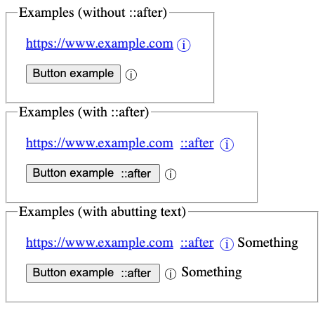
5. Element-backed Pseudo-ElementsThe element-backed pseudo-elements, interact with most CSS and other platform features as if they were real elements (and, in fact, often are real elements that are not otherwise selectable). Element-backed pseudo-elements are always tree-abiding. Unless otherwise specified, they are fully styleable and inherit from their originating element, just like standard tree-abiding pseudo-elements; but they can be defined to inherit from another element instead. (For example, ::part() inherits from the parent of the element it represents in the shadow tree.) All pseudo-classes and pseudo-elements are syntactically allowed after an element-backed pseudo-element (such as x-button::part(label):hover or x-button::part(label)::before), just as if the pseudo-element were a type selector; but some are disallowed from matching:
An element-backed pseudo-element can define itself as representing a real element (possibly one not accessible in the current tree). If it does so, all pseudo-classes and pseudo-elements not otherwise disallowed (see above) match as they would on that real element. If it does not do so, it must define which pseudo-classes it matches and when; however, unless otherwise specified, any pseudo-classes allowed on tree-abiding pseudo-elements are always allowed on element-backed pseudo-elements. 5.1. File Selector Button: the ::file-selector-button pseudo-elementThe ::file-selector-button pseudo-element
targets the <button>
inside an <input> element with Tests
There is no restriction on which properties apply to the ::file-selector-button pseudo-element.
For example, the following example should show a green border around the
file selector button:
::file-selector-button 5.2. Expandable contents of details element: the ::details-content pseudo-elementThe ::details-content pseudo-element targets
the additional information in a Testsdetails element There is no restriction on which properties apply to the ::details-content pseudo-element.
For example, the following example would
animate the opacity of the additional information
when the
details element opens:
Note: The default UA stylesheet styles a closed ::details-content with content-visibility: hidden, so the contents are still considered present for the purpose of find-in-page and similar features. This, however, only suppresses the display of the pseudo-elements’s contents; if margin, borders, etc are set on the pseudo-element, they’ll still be visible. Use [open]::details-content to apply these styles if that’s undesirable. 6. Overlapping Pseudo-element Interactions
Recall that
The following CSS and HTML example illustrates how overlapping pseudo-elements interact:
The first letter of each P element will be green with a font size of ’24pt'. The rest of the first formatted line will be blue while the rest of the paragraph will be red. Assuming that a line break will occur before the word "ends", the fictional tag sequence for this fragment might be:
7. Additions to the CSS Object Model7.1.
|
| You are visitor 01402503 — GeezerVison does not store the pages you look up. Best viewed with Netscape Navigator 4.7 or Internet Explorer 6 at 800×600. No cookies required. |