CSS layout has several different concepts of automatic sizing that are used in various layout calculations.
This section defines some more precise terminology
to help connect the layout behaviors of this spec to the calculations used in other modules,
and some new keywords for the width and height properties
to allow authors to assign elements the dimensions resulting from these size calculations.
In addition to the property-specific values listed in their definitions,
all properties defined in this specification
also accept the CSS-wide keywords as their property value.
For readability they have not been repeated explicitly.
Note:intrinsic sizing keywords such as max-content are indefinite,
even if they can be determined without laying out the children
e.g. due to size containment or lack of children.
available space
A size representing the space into which a box is laid out,
as determined by
the rules of the formatting context in which it participates.
The space available to a box is usually
either a measurement of its containing block (if that is definite)
or an infinite size (when it is indefinite).
Available space can alternatively be either a
min-content constraint or
a max-content constraint,
which forces boxes laid into it to be laid out under that constraint.
Tests
The stretch fit into a given size
is that size,
minus the box’s computed margins (not collapsed, treating auto as zero),
border, and padding in the given dimension
(such that the outer size is a perfect fit),
and flooring at zero
(so that the inner size is not negative).
Note: This is the formula used to calculate the auto widths
of non-replaced blocks in normal flow in CSS2.1§10.3.3.
fallback size
Some sizing algorithms do not work well with an infinite size.
In these cases, the fallback size is used instead.
Unless otherwise specified,
this is the size of the initial containing block.
2.1.
Auto Box Sizes
There are four types of automatically-determined sizes in CSS
(sizes resulting from auto sizing rules, depending on context):
Note: Calculations involving this size need to specify a fallback behavior
for when the available space is indefinite
if that happens to be possible.
max-content size
A box’s “ideal” size in a given axis when given infinite available space.
Usually this is the smallest size the box could take in that axis
while still fitting around its contents,
i.e. minimizing unfilled space while avoiding overflow.
If the ideal max-content size would be smaller than the min-content size
(e.g. due to the use of negative margins)
the effective max-content size is floored by the min-content size.
min-content size
Nominally, the smallest size a box could take
that doesn’t lead to overflow
that could be avoided by choosing a larger size.
Formally, the size of the box when sized under a min-content constraint,
see § 5 Intrinsic Size Determination.
min-content inline size
The min-content size in the inline axis.
Typically, the inline size that would fit around its contents
if all soft wrap opportunities within the box were taken.
Note: This is called the “preferred minimum width” in CSS2.1§10.3.5
and the “minimum content width” in CSS2.1§17.5.2.2.
A max-content size or min-content size,
i.e. a size arising primarily from the size of the content.
(Some uses of this term may refer also to sizes
derived primarily from one of these two sizes.)
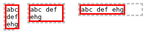
In the narrowest containing block (2ch),
the box takes its min-content size—overflowing its containing block in order to fully contain all its content,
which has wrapped as narrowly as possible.
In the middle containing block (9ch),
the box takes its stretch-fit size—filling the containing block exactly
while its content wraps to fit inside.
In the widest containing block (16ch),
the box takes its max-content size—smaller than the containing block,
but fitting around its unwrapped contents exactly.
Intrinsic size contributions are based on the outer size of the box;
for this purpose auto margins are treated as zero.
If the ideal max-content contribution would be smaller than the min-content contribution
(e.g. due to the use of negative margins)
the effective max-content contribution is floored by the min-content contribution.
A width:height ratio inherent to a box,
which biases various sizing algorithms
to produce a size consistent with that aspect ratio
insofar as possible while honoring other sizing inputs.
Unless otherwise specified,
a box’s preferred aspect ratio is its natural aspect ratio if it has one
and is applied to its content box.
Most boxes do not have a preferred aspect ratio.
Tests
In CSS, while the minimum and maximum sizes
both constrain the used size,
the minimum size constraint is always the strongest constraint.
Furthermore, the inner size is always floored at zero.
Percentages are resolved against the width/height, as appropriate,
of the box’s containing block.
If, in a particular axis,
the containing block’s size depends on the box’s size,
see the relevant layout module
for special rules on how to resolve percentages.
For width/height, specifies an automatic size
(automatic block size/automatic inline size).
See the relevant layout module for how to calculate this.
For min-width/min-height,
specifies an automatic minimum size.
Unless otherwise defined by the relevant layout module,
however,
it resolves to a used value of 0.
For backwards-compatibility,
the resolved value of this keyword is zero
for boxes of all [CSS2]display types
(block and inline boxes,
inline blocks,
and all table display types)
when aspect-ratio is auto.
It also resolves to zero
when no box is generated.
To have a common term for both when
width/height computes to auto
and when it is defined to behave as if auto were specified
(as in the case of block percentage heights
resolving against an indefinite size,
see CSS2§10.5),
the property is said to behave as auto
in both of these cases.
Note: Legacy spec prose defining layout behavior, particularly in [CSS2],
might explicitly refer to width/height having a computed value of auto as a condition;
some of these cases should be interpreted as meaning behaves as auto,
and reported to the CSSWG for updating.
Replace this section with references to the new term automatic size.
3.2.2.
Containing or Excluding Floats
This section is non-normative.
Although block box boundaries are typically pervious to floats,
sometimes an author needs them to contain their own (descendant) floats
or to exclude floats from outside.
For Block layout,
specifying display: flow-root
will make the box a formatting context root,
which has this behavior.
Note: Boxes participating in Flex, Grid, or Table layout will automatically have this behavior.
3.3.
Box Edges for Sizing: the box-sizing property
Any <length-percentage> values in the sizing properties
are applied to the border box,
thus representing the box’s visually-apparent sizes:
the padding and border of the box (but not its margins)
are essentially laid out and drawn inside the used width and height,
with the content box sized to fill the remaining space.
More specifically,
the content boxwidth and height are calculated
by subtracting the border and padding in the corresponding axis
from the specified <length-percentage>,
and flooring the result at zero
(as the inner size of a box cannot be negative).
Values affected by box-sizing include
both raw <length-percentage> values
and those used in functional notations such as fit-content()[css-sizing-4].
In contrast,
non-quantitative values such as auto and min-content
are not influenced by the box-sizing property
(unless otherwise specified).
For example, the following properties set
the content-box size of the box to 100px,
with the border-box size calculating to 120px:
The inner size can’t be less than zero,
so if the padding + border is greater than the specified border-box size,
the box will end up larger than specified.
In this case, the content-box size will floor at 0px
so the border-box size ends up at 120px,
even though width: 100px is specified for the border box:
This example uses box-sizing to evenly horizontally split
two divs with fixed size borders inside a div container,
which would otherwise require additional markup.
<divclass="container"><divclass="split">This div occupies the left half.</div><divclass="split">This div occupies the right half.</div></div>
demonstration of sample CSS and HTML:
This div should occupy the left half.
This div should occupy the right half.
The two divs above should appear side by side, each (including borders) 50% of the content width of their container. If instead they are stacked one on top of the other then your browser does not support box-sizing.
Note: Certain HTML elements,
such as button,
default to border-box behavior.
See HTML for details on which elements have this behavior.
To avoid ambiguities,
specification authors should avoid ambiguous uses of terms such as width or height without further qualification,
and should explicitly refer and link to
the inner size,
the outer size,
the size of the border-box,
the computed value of the sizing properties,
etc,
as appropriate for each case.
Note: The column width never varies by column.
When the column width is informed by the multi-column container’s contents
(as in the keywords above),
all of its contents are taken under consideration
and the calculated width is shared by all the columns.
4.
Extrinsic Size Determination
Extrinsic sizing determines sizes based on the context of an element,
without regard for its contents.
4.1.
Percentage Sizing
Percentages specify sizing of a box with respect to the box’s containing block.
If used in an axis where percentage sizes can resolve to a definite value
Sizes the margin box to fill the containing block exactly,
treating auto margins as zero.
(If this would make the inner size negative,
it instead sizes the margin box so that the inner size is zero.)
Note: This simulates the effect of margins collapsing with the parent’s margin.
It doesn’t actually suppress the margins,
so if anything prevents the element from actually collapsing with its parent,
the stretch-fit size might actually be too large
to fit in the parent perfectly.
In the following case,
the outer height of the child box
will exactly match the height of the parent box (200px),
but its inner height will be 20px less, to account for its margins.
On the other hand,
in this case we can assume that the child’s margins will collapse with the parent,
so the inner box will be 200px tall,
exactly filling the parent.
(The top margins will in fact collapse,
but the bottom margins do not collapse,
because the bottom margin of a box is not adjoining
to the bottom margin of a parent with a non-auto height,
see CSS 2 § 8.3.1 Collapsing margins.
Luckily, an overflowing bottom margin doesn’t have any visible effect.)
Similarly, width: stretch causes the box to fill its container,
being 20px narrower than the width of "some more text"
(due to the 10px margin):
<div class="parent">
  <div class="child">text</div>
</div>
some more text
On the other hand,
in this example the container’s height is indefinite,
which would cause a percentage height on the child to behave as auto,
so height: stretchbehaves as auto as well.
The min-content size of a box in each axis
is the size it would have if it was
a float given an autopreferred size in that axis
(and no minimum or maximum size in that axis)
and if its containing block was zero-sized in that axis.
(In other words, the minimum size it has when sized as “shrink-to-fit”.)
The max-content size of a box in each axis
is the size it would have if it was
a float given an autopreferred size in that axis
(and no minimum or maximum size in that axis),
and if its containing block was infinitely-sized in that axis.
(In other words, the maximum size it has when sized as “shrink-to-fit”.)
Note: When the box has a preferred aspect ratio,
size constraints in the opposite dimension will transfer through
and can affect the auto size in the considered one.
See CSS2§10.
Otherwise
if the box has a <length> as its computed value
for min-width or min-height,
use that size and calculate the other dimension using the aspect ratio;
if both dimensions have a <length> minimum,
choose the one that results in the larger overall size.
Note: This case was previous calculated from a 300x150 default size,
rather than the box’s min size.
This is believed to be a better behavior,
and likely to be Web-compatible,
but please send feedback to the CSSWG if there are any problems.
Otherwise
use an inline size matching
the corresponding dimension of the initial containing block
and calculate the other dimension using the aspect ratio.
Note: This author-controllable behavior is made possible
by the new auto value for the min size properties.
This is believed to be a better behavior,
but it is not yet clear if it is Web-compatible,
so please send feedback to the CSSWG if there are any problems.
Otherwise,
use 300px for the width
and/or 150px for the height
as needed.
Note: This does not imply an aspect ratio.
Since a block-level or inline-level replaced element
whose height or widthbehaves as auto
is effectively defined to use its max-content size
(CSS2§10.3.2),
this specification applies the rules above
to the undefined case of a replaced element
whose height and width both behave as auto.
Note: This specification does not define how to determine
the size of a float.
Please refer to [CSS2],
the relevant CSS specification for that display type,
and/or existing implementations
for further details.
A future specification will define this in detail,
replacing the CSS2 “definition”,
such as it is.
Although the auto size of text input controls
such as HTML’s <input type=text> and <textarea> elements
is typically a fixed size,
the contents of such elements can be used to determine a content-based intrinsic size,
as for non-replaced block containers.
The min-content and max-content keywords of the sizing properties
thus represent content-based sizes
for form controls which render their value
as text contained within their box,
allowing such controls to size to fit their visible contents
similarly to regular non-replaced elements.
The content in this case is defined to be the input control’s values
(the raw value in the case of textarea,
or the value in the case of input),
possibly transformed to a more human-readable and/or localized display format,
which is then treated as child text sequences of the input control,
allowing soft wrap opportunities
only where the input control would actually allow wrapping
(whether keyed off of CSS properties or other, UA-internal constraints).
If the input control has designated placeholder text
to be overlaid in its value display area,
then that text is also measured for the purpose of calculating the content-based size—whether or not the placeholder text is visible at the moment.
(Thus the content-based intrinsic size of the input control
is the larger of the size to fit the placeholder text and the size to fit the value.)
The UA may enforce a minimum
(such as the size required to contain a single zero-width character,
or the smallest usable size of a touch target)
on the form control’s
min-content and max-content sizes
to ensure sufficient space for the caret
and otherwise maintain usability of the form control.
Note:
This might be extended to iframe or other content-containing replaced elements
(see discussion),
but text inputs are a major use-case;
and being document-internal,
have the least additional complications.
A box’s min-content contribution/max-content contribution in each axis
is the size of the content box
of a hypothetical auto-sized float
that contains only that box,
if that hypothetical float’s containing block is zero-sized/infinitely-sized.
Note: This specification does not define precisely how to determine these sizes.
Please refer to [CSS2],
the relevant CSS specification for that display type,
the rules for handling percentages (below),
and/or existing implementations
for further details.
For this purpose, stretchself-alignment and stretch-fit sizing
(when they are able to resolve extrinsically)
are considered definite the same way as resolveable percentages.
5.2.1.
Intrinsic Contributions of Percentage-Sized Boxes
Sometimes the size of a percentage-sized box’s containing block
depends on the intrinsic size contribution of the box itself,
creating a cyclic dependency.
When calculating the intrinsic size contribution of such a box
(including any calculations for a content-based automatic minimum size),
a percentage value that resolves against a size
in the same axis as the intrinsic size contribution
(a cyclic percentage size)
is resolved specially:
Should we resolve transferred percentages against their containing block instead of zero before transferring them? See discussion.
The UA may additionally floor the min-content contribution
based on UI considerations,
such as ensuring certain UI elements remain visible
(for example, the dropdown arrow on a select).
This rule also applies when calculating
a content-based automatic minimum size
or its corresponding size contribution,
yielding a definite “specified size suggestion”.
Note:Grid items in both axes,
flex items in the main axis,
and children of flex items in both axes
do allow percentages to resolve in this case.
Otherwise, the percentage is resolved against the containing block’s size.
(The containing block’s size is not re-resolved based on the resulting size of the box;
the contents might thus overflow or underflow the containing block).
Note: These rules specify the previously-undefined behavior of this cyclic case
in CSS2§10.2,
CSS2§8.3,
and
CSS2§8.4.
Note also, the behavior in CSS2§10.5
is superseded in their respective specifications for layout modes
(such as flex layout)
not described in CSS2.
When calculating the width of the outer <article>,
the inner <aside> behaves as width: auto,
so the <article> sets itself to the width of the long word.
Since the <article>’s width didn’t depend on "real" layout,
though, it’s treated as definite
for resolving the <aside>,
whose width resolves to half that of the <article>.
because the percentage block size (height, in this case) on block-level elements
is defined to not resolve inside content-sized containing blocks,
the percentage height on the <aside> is ignored,
that is, it behaves exactly as if auto were specified.
Letting percentages still resolve against a definite height
when the min-height is intrinsic is an open issue.
(CSS2 has a general statement about "height depending on contents",
which this technically is,
even though CSS2 didn’t have content-dependent keywords for min-height.
Since this is new, we think we could have this different behavior.)
The following examples illustrate how block-axis percentages resolve against a containing block whose size depends on its contents.
The initial height of the <article> is 100px, as specified,
which would make the <aside> 50px tall
when it resolved its percentage.
However, we must calculate the min-height,
by substituting it in for height.
This causes the percentage on the <aside> to behave as auto,
so the <aside> ends up 150px tall.
The total height of the contents is thus 180px.
This is larger than the specified 100px height,
so the <article> gets adjusted to 180px tall.
Then, since the percentage could originally resolve against the (100px) height,
it now resolves against the 180px height,
so the <aside> ends up being 90px tall.
In this case, the percentage on the <aside> won’t normally resolve,
because the containing block’s height is auto
(and thus depends on the size of its contents).
Instead it behaves as auto,
resulting in a height of 150px for the <aside>,
and an initial height of 180px for the <article>
The min-height doesn’t change this;
height: min-content; acts similarly to height: auto;
and results in the same sizes.
This is a variation on the first code block,
and follows a similar path;
the <aside> initially wants to compute to 200px tall
(200% of the 100px containing block height).
When we calculate the effects of min-height,
the percentage behaves as auto,
causing it to become 150px tall,
and the total min-content height of the containing block
to be 180px tall.
Since this is larger than 100px,
the <article> gets clamped to 180px,
the percentage resolves against this new height,
and the <aside> ends up being 360px tall,
overflowing the <article>
input with any type that is not "button-like";
this can vary depending on the UA.
A type is "button-like" in a particular UA if it displays similar to a button element,
where it can contains actual content that determines the layout of the element.
In most UAs, the "button", "reset", "submit", and "color" types are button-like;
the "file" type is also partially button-like in some UAs,
when it’s displayed as a combination of a text input (shrinkable)
and a button (button-like, and thus not shrinkable).
Introduced <box-size> grammar production to consolidate sizing values.
(Issue 13478)
Clarified that rules for finding the intrinsic size of replaced elements with a preferred aspect ratio only apply when the aspect ratio is non-degenerate.
(Issue 12612)
Defined that min-content and max-content
do not necessarily behave the same as the property’s initial value
if otherwise specified (by the relevant layout module).
(Issue 3973)
Switched intrinsic contribution of fit-content()
to treat its argument as that argument would be treated alone
for intrinsic contribution calculations
and resolve the fit-content formula accordingly,
rather than having special behavior for fit-content() resolution
when calculating intrinsic contributions.
(Issue 3731)
Changed the *-content values applied to the bock axis
to not compute to the property’s initial value,
but to rather “behave as” the property’s initial value.
(#2708)
In addition to substantially more detail
to the various automatic and content-based sizing algorithms,
the following new features have been added since [CSS2]:
Special thanks go to
L. David Baron,
Aaron Gustafson,
Daniel Holbert,
and
Mats Palmgren
for their contributions to this module.
Privacy Considerations
In order to support automatic layout,
CSS sizes boxes to fit their contents.
In conjunction with various [DOM] and [CSSOM] APIs
which can return the size of those boxes to script,
this can expose information about those contents.
However, this information is more directly and easily available
by inspecting the DOM for the contents,
rather than indirecting through the box’s size.
Containers that can’t have their contents inspected
(such as cross-origin iframes)
also do not expose sizing information to the outer page,
except insofar as replaced elements such as images
expose their natural size and/or aspect ratio.
Security Considerations
No new security considerations have been reported on this specification.
You are visitor 01402503 — GeezerVison does not store the pages you look up. Best viewed with Netscape Navigator 4.7 or Internet Explorer 6 at 800×600. No cookies required.