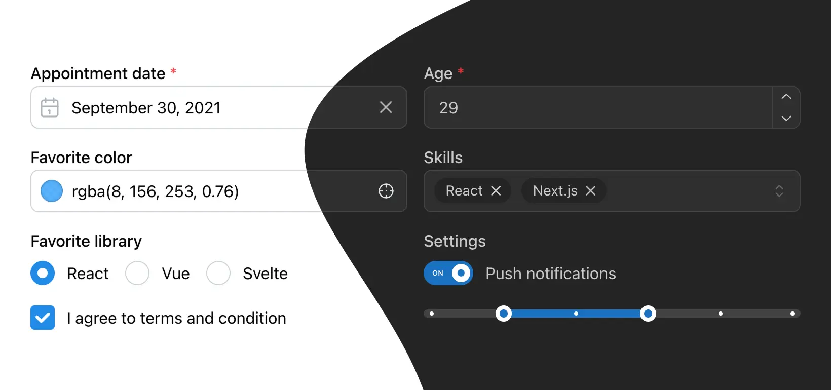
Build fully functional accessible web applications faster than ever – Mantine includes more than 120 customizable components and 70 hooks to cover you in any situation
LLM-optimized docs, agent skills for complex tasks, and an MCP server for direct API access — Mantine is designed to work with Cursor, Claude Code, Windsurf, and every AI coding tool you already use.
llms.txt and llms-full.txt files follow the LLMs.txt standard – use them with Cursor, Windsurf, ChatGPT, Claude, and other AI tools
Skills for AI agents
Install Mantine skills for complex tasks like building forms, custom components, and combobox-based inputs
MCP server
Use @mantine/mcp-server to give AI agents direct access to component docs, props, and search across the entire library
Always up to date
LLM documentation is regenerated with every release – AI tools always have access to the latest API and examples
# Reference Mantine docs in Cursor
@Docs https://mantine.dev/llms.txt

# Or download full documentation
curl -o mantine-docs.txt https://mantine.dev/llms-full.txt

# Use with ChatGPT/Claude
"Using Mantine, how do I create a dark mode toggle?
Reference: https://mantine.dev/llms.txt"
120+ components
Build your next app faster with high-quality, well-tested components. Mantine includes everything you need to create complex web applications with ease: custom select, date pickers, notifications, modals, and more.
Text input
Number input
Date range picker
Color input
Tree select
File input
Select
Multiselect
ReactVue
Pin input
Hooks library
70+ hooks for handling tricky and common parts of your application
Mantine styles are exposed as .css files – styles are performant and do not have any runtime overhead
Override anything
All Mantine components support Styles API which allows to override any part of component styles with inline styles of classes
PostCSS preset
postcss-preset-mantine includes mixins and functions to apply dark/light, rtl and responsive styles
Compatible with any styling solution
You can bring your own library to style Mantine components (Emotion, Vanilla Extract, Sass, etc.) – you are not limited to any specific tool
.root {
  border-top-left-radius: var(--mantine-radius-xl);
  border-bottom-left-radius: var(--mantine-radius-xl);
  padding-left: 4px;

  /* The following styles will be applied only when button is disabled */
  &[data-disabled] {
    /* You can use Mantine PostCSS mixins inside data attributes */
    @mixin light {
      border: 1px solid var(--mantine-color-gray-2);
    }

    @mixin dark {
      border: 1px solid var(--mantine-color-dark-4);
    }

    /* You can target child elements that are inside .root[data-disabled] */
    & .section[data-position='left'] {
      opacity: 0.6;
    }
  }
}

.section {
  /* Apply styles only to left section */
  &[data-position='left'] {
    --section-size: calc(var(--button-height) - 8px);

    background-color: var(--mantine-color-body);
    color: var(--mantine-color-text);
    height: var(--section-size);
    width: var(--section-size);
    display: flex;
    align-items: center;
    justify-content: center;
    border-radius: var(--mantine-radius-xl);
  }

  &[data-position='right'] {
    @mixin rtl {
      transform: rotate(180deg);
    }
  }
}
Dark color scheme
Add dark theme to your application with just a few lines of code – Mantine exports global styles both for light and dark theme, all components support dark theme out of the box.
import { MantineProvider } from '@mantine/core';

function Demo() {
  return (
    <MantineProvider defaultColorScheme="dark">
      <App />
    </MantineProvider>
  );
}
Combobox component
Combobox is a composable component which can be used to create custom select, multiselect, autocomplete, tags input and other similar components. It provides a lot of flexibility and gives you full control over the UI and behavior while keeping your codebase clean and simple.
You can select up to 2 items, currently selected: 0
🍎 Apples
🍌 Bananas
🥦 Broccoli
🥕 Carrots
🍫 Chocolate
🍎 Apples
🍌 Bananas
🥦 Broccoli
🥕 Carrots
🍫 Chocolate
🍎 Apples
🍌 Bananas
🥦 Broccoli
🥕 Carrots
🍫 Chocolate
🍇 Grapes
🍎
Apples
Crisp and refreshing fruit
🍌
Bananas
Naturally sweet and potassium-rich fruit
🥦
Broccoli
Nutrient-packed green vegetable
🥕
Carrots
Crunchy and vitamin-rich root vegetable
🍫
Chocolate
Indulgent and decadent treat
🍎 Apples
🍌 Bananas
🍓 Strawberries
🥦 Broccoli
🥕 Carrots
🥬 Lettuce
Extensions
Extensions are additional packages that provide extra functionality to Mantine, such as rich text editor, notifications system, charts, modals manager and more. They are built to be easily integrated into your application and provide a seamless experience.
useForm hook works out of the box with all Mantine inputs
Excellent performance
useForm rerenders only for validation and status changes, usually only 2-3 times per form lifecycle
Lightweight
6.3kb minified + gzipped, no dependencies except React
Fully featured
useForm supports lists and nested objects, multiple validation approaches (including schema based with zod) and an easy way to manage subscriptions to values updates
Build your next website even faster with premade responsive components designed and built by Mantine maintainers and community. All components are free forever for everyone.
I am a senior Frontend Developer and wanted to use something new instead of Material UI and came across this, it has been well thought of all the different scenarios you and come across, and the hooks are just pure love :)
Man, I've been doing Front-End for 20 years. This is, hands-down, the best component library I've ever used. What's more, the parts that I didn't like (Styling from JS Objects, slow with big forms) have been addressed in v7. Please keep it up, this library deserves more exposure, it just works and works well and beautifully. Many thanks to @rtivital and the contributors!
Hope this kind of post is ok - just wanted to say thank you.
I've been writing software professionally for 25 years, with the last 15 in web (mostly internal projects in my company). This is easily the best component library I've ever used.
In every other instance I've run into the boundaries of what the library does and have to spend a lot of time and energy customizing or extending it. Not only does Mantine provide easy access to everything under the hood, but 99% the things you need are provided as default options. I've started to lose count of the "guess I'd better build my standard xyz... oh wait, they have that too" moments. Also the docs are perfect.
Dear Mantine Team, thank you for putting this library together. I have started to use and love Mantine in my free time, and bringing this great library to good use in our company now. All the developers are very pleased with the development experience, the time savings for any bigger project is insane. The amount of flexibility we have with our designers and developers will result in great products. All thanks to every contributor. Continue the good work!
Mantine has a solution for every problem I’ve needed to solve in my web app. Components and props are named clearly, design choices promote simplicity, and it looks beautiful out of the box. Thank you for jump starting my application in a big way!
Out of all react component libraries that I have ever seen this one is the most straight forward, easy to use, well documented and really beautiful. I plan on switching and using this full time. Just wanted to say huge thanks to the people that made this.
Join the community
Mantine is an open-source project with a growing community of developers and contributors. Join us on GitHub, Discord, Twitter and other platforms to stay updated and get help with your projects.
Mantine can be used with any modern React framework or build tool: get started with Next.js, Vite, React Router and other tools in minutes by following the installation guide or using one of the available templates.
You are visitor 01402503 — GeezerVison does not store the pages you look up. Best viewed with Netscape Navigator 4.7 or Internet Explorer 6 at 800×600. No cookies required.