GeezerVisonThe World Wide Web, restored to 800 pixels of glory. | |||||||||||||||||||||||||||||||||||||||||||||||||||||||||||||||||||||||||||||||||||||||||||||||||||||||||||||||||||||||||||||||||||||||||||||||||||||||||||||||||||||||||||||||||||||||||||||||||||||||||||||||||||||||||||||||||||||||||||||||||||||||||||||||||||||||||||
| Home|About|Gaming cabinet|Archives|How it works|Starter sites | |||||||||||||||||||||||||||||||||||||||||||||||||||||||||||||||||||||||||||||||||||||||||||||||||||||||||||||||||||||||||||||||||||||||||||||||||||||||||||||||||||||||||||||||||||||||||||||||||||||||||||||||||||||||||||||||||||||||||||||||||||||||||||||||||||||||||||
GeezerVison is showing drafts.csswg.org — CSS Inline Layout Module Level 3 1. IntroductionThis module defines inline layout, the CSS model for laying out a mixed stream of text and inline-level boxes, and defines controls for the block-axis alignment and sizing of this content within each line. It also adds a special layout mode for drop caps and similar initial letter styling. Note: Line-breaking, justification, and other aspects of inline-axis positioning of inline-level content are handled in the CSS Text Module. Many aspects of layout here depend on font metrics. While the relevant metrics exist in OpenType for Latin/Cyrillic/Greek and for CJK, they are missing for many other writing systems. For example, the visual top metric for Hebrew has no metric in the OpenType tables. For this module to work well for the world, we need fonts to provide the relevant metrics for all writing systems, and that means both that OpenType needs to allow such metrics and font designers need to provide accurate numbers. See issue and liaison statement. 1.1. Module InteractionsThis module replaces and extends the CSS inline layout model and features defined in [CSS2] section 10.8. 1.2. Value DefinitionsThis specification follows the CSS property definition conventions from [CSS2] using the value definition syntax from [CSS-VALUES-3]. Value types not defined in this specification are defined in CSS Values & Units [CSS-VALUES-3]. Combination with other CSS modules may expand the definitions of these value types. In addition to the property-specific values listed in their definitions, all properties defined in this specification also accept the CSS-wide keywords as their property value. For readability they have not been repeated explicitly. 2. Inline Layout ModelIn inline layout, a mixed, recursive stream of text and inline-level boxes forming an inline formatting context within a block container are laid out by fragmenting them into a stack of line boxes. Within each line box, inline-level boxes are aligned to each other along the block axis, typically by the baselines of their text. Any block container that directly contains inline-level content—such as inline boxes, atomic inlines, and text sequences—establishes an inline formatting context to lay out its contents using inline layout. The block container’s content edges form the containing block for each of the inline-level boxes participating in its inline formatting context. The block container also generates a root inline box, which is an anonymous inline box that holds all of its inline-level contents. (Thus, all text in an inline formatting context is directly contained by an inline box, whether the root inline box or one of its descendants.) The root inline box inherits from its parent block container, but is otherwise unstyleable. In an inline formatting context, content is laid out along the inline axis, ordered according to the Unicode bidirectional algorithm and its controls [CSS-WRITING-MODES-3] and distributed according to the typesetting controls in [CSS-TEXT-3]. Inline-axis margins, borders, and padding are respected between inline-level boxes (and their margins do not collapse). The resulting rectangular area that contains the boxes that form a single line of inline-level content is called a line box. Note: Line boxes and inline boxes and inline-level boxes are each different things! See [CSS-DISPLAY-3] for an in-depth discussion of box types and related terminology. 2.1. Layout of Line BoxesLine boxes are created as needed to hold inline-level content within an inline formatting context. When an inline box exceeds the logical width of a line box, or contains a forced line break, it is split (see CSS Text 3 § 5 Line Breaking and Word Boundaries) into several fragments [CSS-BREAK-3], which are partitioned across multiple line boxes. Like column boxes in multi-column layout [CSS-MULTICOL-1], line boxes are fragmentation containers generated by their formatting context, and are not part of the CSS box tree. Note: Inline boxes can also be split into several fragments within the same line box due to bidirectional text processing. See [CSS-WRITING-MODES-3]. Line boxes are stacked as the direct contents of the block container box in its block flow direction and aligned within this container as specified by align-content [CSS-ALIGN-3]. Thus, an inline formatting context consists of a stack of line boxes. Line boxes are stacked with no separation (except as specified elsewhere, e.g. for float clearance) and they never overlap. In general, the line-left edge of a line box touches the line-left edge of its containing block and the line-right edge touches the line-right edge of its containing block, and thus the logical width of a line box is equal to the inner logical width of its containing block (i.e. the block container’s content box). However, floating boxes or initial letter boxes can come between the containing block edge and the line box edge, reducing the space available to, and thus the logical width of, any such impacted line boxes. (See CSS 2 § 9.4.2 Inline formatting contexts/CSS 2 § 9.5 Floats and § 7 Initial Letters.) The logical height of a line box is fitted to its contents once they have been block-axis aligned. This fit is controlled by line-height and line-fit-edge. The first/last line boxes in a block container may additionally be trimmed by text-box-trim. 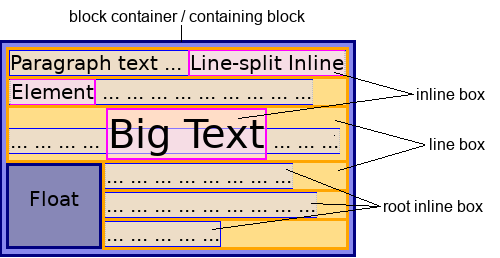
2.2. Layout Within Line BoxesAs described above, user agents flow inline-level boxes into a stack of line boxes. Layout within each line box is performed, sizing and positioning each box fragment and line box independently, as follows:
Note: Empty inline boxes still have margins, padding, borders, and a line-height, and thus influence these calculations just like boxes with content. 2.3. Phantom Line BoxesLine boxes that contain no text, no preserved white space, no inline boxes with non-zero inline-axis margins, padding, or borders, and no other in-flow content (such as atomic inlines or ruby annotations), and do not end with a forced line break are phantom line boxes. Such boxes must be treated as zero-height line boxes for the purposes of determining the positions of any descendant content (such as absolutely positioned boxes), and both the line box and its in-flow content must be treated as not existing for any other layout or rendering purpose. What’s invisible?Such phantom line boxes, which can still contain unstyled empty inline boxes, out-of-flow boxes, and/or collapsed document white space, are ignored, for example, for:
Firefox allows the inline boxes within a phantom line box to accept outline,which allows it to make focus rings visible. As in other browsers, all other properties that could make the element visible (e.g. box-shadow) seem to be ignored. 2.4. Painting OrderExcept as specified for positioned boxes (see [CSS-POSITION-3]) inline-level boxes are painted in document order; the z-index property does not generally apply. 3. Baselines and Alignment Metrics3.1. Introduction to BaselinesA baseline is a line along the inline axis of a line box along which individual glyphs of text are aligned. Baselines guide the design of glyphs in a font (for example, the bottom of most alphabetic glyphs typically align with the alphabetic baseline), and they guide the alignment of glyphs from different fonts or font sizes when typesetting. 
Different writing systems prefer different baselines. 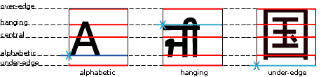
A well-constructed font contains a baseline table, which indicates the position of one or more baselines within the font’s design coordinate space. (The design coordinate space is scaled with the font size.) 
The baseline table is a property of the font, and the positions of the various baselines apply to all glyphs in the font. Different baseline tables can be provided for alignment in horizontal and vertical text. UAs should use the vertical tables in vertical typographic modes and the horizontal tables otherwise. Note: Fonts can have more than one baseline table in each axis; the UA is responsible for choosing the appropriate table in consideration of font-language-override and the content language. 3.2. Baselines and MetricsCSS uses the following text-based metrics as baselines for inline layout functions such as alignment, box sizing, and initial letter layout. The CSSWG would like to know which baseline values are necessary for each property that uses them (dominant-baseline, alignment-baseline, text-box-edge, line-fit-edge, initial-letter-align): if any can be dropped, or any need to be added. See Issue 859.
Note: These metrics are optical design metrics, and therefore do not necessarily correspond exactly to actual glyph outlines. In general, these metrics are taken from the appropriate font, but if they are missing or need to be derived from a box rather than text, they must be synthesized, see § 3.3 Baselines of Glyphs and Boxes and Appendix A: Synthesizing Alignment Metrics. 3.2.1. Ascent and Descent MetricsCSS assumes that every font has font metrics that specify a characteristic height above the baseline—called the ascent metric—and a characteristic depth below it—called the descent metric—which CSS uses for laying out text and boxes in an inline formatting context. Note that these are metrics of the font as a whole and need not correspond to the ascender and descender of any individual glyph. Note: It is recommended that implementations that use OpenType or TrueType fonts
use the metrics 3.2.2. Line Gap MetricsFont formats can allow for a font-recommended “line gap” or “external leading” metric. This metric is referred to as the line gap metric, and may be incorporated into the line box logical height calculations when line-height is normal as described in § 5.3 Calculating the Logical Height Contributions (“Layout Bounds”) of Inline Boxes. Note: In OpenType, the line gap metric can be found
as UAs must floor the line gap metric at zero. 3.3. Baselines of Glyphs and BoxesEach font, glyph, and inline-level box is assumed to have a baseline coordinate for each baseline type indicating that baseline’s position on its block axis. The set of such baselines is called its baseline set. The baseline from this set that is used to align the box or glyph within its alignment context is called its alignment baseline; the baseline used to align its content within itself is called its dominant baseline. For an individual glyph, the baseline set derives from the font’s baseline table. For an inline box, it derives from its first available font regardless of whether the box actually contains any glyphs from that font. If the requisite metrics are missing from a font, the UA must synthesize them, see A.2: Synthesizing Baselines (and Other Font Metrics) for Text. For other boxes, its baseline set is nominally derived from its contents in accordance with baseline-source and the rules of the formatting context in which it participates. For an atomic inline box with no baseline set in the inline formatting context’s inline axis its alignment baselines are synthesized from its margin box, see A.3: Synthesizing Baselines for Atomic Inlines. 4. Baseline AlignmentWhile most CSS formatting contexts position content by aligning boxes with respect to their container’s edges, inline layout positions boxes in the block axis by aligning them with respect to each other using their baselines. More specifically, (unless using a line-relative shift value) each glyph or inline-level box is aligned in the block axis by positioning its alignment baseline to match the corresponding baseline of its parent (which is its alignment context), and then is potentially shifted from that position according to its post-alignment shift. Note: Baseline alignment always matches corresponding baselines: alphabetic to alphabetic, hanging to hanging, mathematical to mathematical, etc. When aligning a box, the alignment baseline is chosen according to its alignment-baseline and baseline-source values (see shorthand vertical-align), and defaults to matching the parent’s dominant-baseline. For a glyph, the alignment baseline is always determined by the parent’s dominant baseline. Given following sample markup:
And the following style rule: .inner The baseline sets of the parent ( 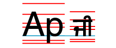
The alphabetic baseline is used here because by default a box’s alignment baseline matches the dominant baseline of its parent, and in horizontal typographic mode, the dominant baseline itself defaults to the alphabetic baseline. If we add vertical-align: super
to the
4.1. Dominant Baselines: the dominant-baseline property
This property specifies the dominant baseline, which is the default baseline type used to align content within the box. For inline boxes, the dominant baseline is used to align the box’s text (and, unless otherwise specified by vertical-align, any inline-level child boxes) by aligning each glyph/box’s corresponding baseline to the box’s own dominant baseline. For other boxes, it indicates the default alignment baseline of any boxes participating in baseline alignment in the box’s alignment context; see (alignment-baseline: baseline and [CSS-ALIGN-3]). The <baseline-metric> value, which identifies specific baseline metrics, expands to <baseline-metric> = text-bottom | alphabetic | ideographic | middle | central | mathematical | hanging | text-top Values have the following meanings:
See [CSS-WRITING-MODES-3] for an introduction to dominant baselines. Define behavior for mixed vertical orientations that isn’t nonsensical when specified baseline isn’t central. 4.2. Transverse Box Alignment: the vertical-align property
This shorthand property specifies how an inline-level box is aligned within the line by specifying its alignment baseline type (alignment-baseline), baseline alignment preference (baseline-source), and post-alignment shift (baseline-shift) in a single declaration. If first or last is specified, it sets baseline-source (which is otherwise reset to auto). Other values are as for the corresponding longhand properties, see below. Authors should use this shorthand (vertical-align) instead of its longhands, unless specifically needing to cascade its longhands independently or (on SVG elements) to support legacy SVG implementations. Note: vertical-align can also affect the alignment of table cells when align-content is normal. Specifically, top (baseline-shift: top) maps it to start, bottom (baseline-shift: bottom) to end, and otherwise middle (alignment-baseline: middle) to center. See CSS Box Alignment 3 § 5.1.1 Block Containers (Including Table Cells). 4.2.1. Alignment Baseline Source: the baseline-source longhand
When an inline-level box has more than one possible source for baseline information (such as for a multi-line inline block or inline flex container) this property specifies whether the first baseline set or last baseline set is preferred for alignment, indicating the box’s baseline alignment preference. Values have the following meanings:
See CSS Box Alignment 3 § 9.1 Determining the Baselines of a Box for how to find the baselines of boxes other than inline boxes. 4.2.2. Alignment Baseline Type: the alignment-baseline longhand
This property specifies the box’s alignment baseline: the baseline used to align the box prior to applying its post-alignment shift (if applicable). Values have the same meanings as for dominant-baseline; the baseline keyword uses the dominant baseline choice of the parent. When performing baseline alignment, these values specify which baseline of the box is aligned to the corresponding baseline of its alignment context. (In an inline formatting context, inline-level box fragments and glyphs share an alignment context established by their parent inline box fragment along its inline axis. For other formatting contexts, see CSS Box Alignment 3 § 9.2 Baseline Alignment Grouping.) In SVG text layout, these values instead specify the baseline that is aligned to the SVG current text position. 4.2.2.1. Legacy Values for SVGSVG implementations may support the following aliases in order to support legacy content:
4.2.3. Post-Alignment Shift: the baseline-shift longhand
This property specifies the box’s post-alignment shift. The baseline-relative shift values <length-percentage>, sub, super shift the box relative to its baseline-aligned position, whereas the line-relative shift values top, center, and bottom shift the inline box and its contents relative to the bounds of its line box. Authors should use the vertical-align shorthand, which has existed since CSS1, instead of this baseline-shift longhand (except in SVG content, where conversely baseline-shift is more widely-supported in legacy user agents). Values have the following meanings:
The aligned subtree of an inline box contains the layout bounds of that box and the aligned subtrees of all child inline boxes whose computed alignment-baseline value is not itself a line-relative shift value. The line-over edge of the aligned subtree is the highest over edge of the layout bounds in the subtree, and the line-under edge is analogously the lowest. The line-relative shift values don’t fit perfectly in the dichotomy between alignment-baseline and baseline-shift. There’s decent arguments for either option. They’re currently drafted here, but if there’s a strong argument to move them, please file an issue for consideration. 4.2.3.1. Legacy Values for SVGUser agents may additionally support the keyword baseline as computing to 0 if is necessary for them to support legacy SVG content. This value is not allowed in the vertical-align shorthand. We would prefer to remove the baseline value, and are looking for feedback from SVG user agents as to whether it’s necessary. 5. Logical Heights and Inter-line SpacingThe block-axis sizing of a line box depends on the sizes and alignment of its inline-level contents. This sizing is controlled by the line-height and line-fit-edge properties. 5.1. Line Spacing: the line-height property
This property specifies the box’s preferred line height, which is used in calculating its “layout bounds”, i.e. its contribution to the logical height of its line box. (See § 5.3 Calculating the Logical Height Contributions (“Layout Bounds”) of Inline Boxes.) Note: Because it applies to the root inline box when specified on a block container, line-height effectively establishes the minimum height of the block’s line boxes. Values for this property have the following meanings:
Note: Metrics from fonts other than the first available font only impact the layout bounds of an inline box with line-height: normal.
The three rules in the example below have the same used line height:
However, they inherit differently: the first one inherits as a number, which will lead to different line heights if descendants have different font sizes; the last two as inherit as absolute lengths, which will not be influenced by the font size on descendants. The fact that percentages compute to lengths is annoying. See also Issue 3118 and Issue 2165. Note: When line-fit-edge is leading, the margins, borders, and padding of inline boxes do not affect the line box’s height calculation. However, they are still rendered around these boxes. This means that if the size specified by line-height is less than the size of the box, backgrounds and borders can “bleed” into adjoining line boxes, potentially obscuring earlier content. 5.2. Text Edge Metrics: the line-fit-edge property
This is an early draft of a proposal, and might change significantly as design critiques and use cases are registered and various details and interactions with other properties are worked out. Do not ship (yet). Inline boxes, whose primary purpose is to contain text, are sized in the block axis based on their font metrics. The line-fit-edge property controls which metrics are used. These chosen metrics are used as the basis for the layout bounds of the inline box (if it is not the root inline box); and also, by default, are the metrics used for text-box-trim. The <text-edge> value, which identifies specific font metrics, expands to <text-edge> = [ text | ideographic | ideographic-ink ] | [ text | ideographic | ideographic-ink | cap | ex ] [ text | ideographic | ideographic-ink | alphabetic ] The first value specifies the text over edge; the second value specifies the text under edge. If only one value is specified, both edges are assigned that same keyword if possible; else text is assumed as the missing value. Do we need longhands or is this shorthand enough? [Issue #5236] Values have the following meanings:
Is text a reasonable name for the ascent/descent metrics, or can we think of something better? Ditto leading as a keyword. [Issue #8067] Unless line-fit-edge is leading—in which case the box’s own line-height is used to add spacing—the box’s margin, padding, and border also contribute to the layout bounds. Note: The leading and text values rely on the font ascent and descent to make sure the text fits. Other values are more likely to result in overlap or overflow caused by ascents above the specified metrics (such as for diacritics), so authors using these values need to be careful to provide sufficient spacing for the text, particularly in multi-lingual contexts. 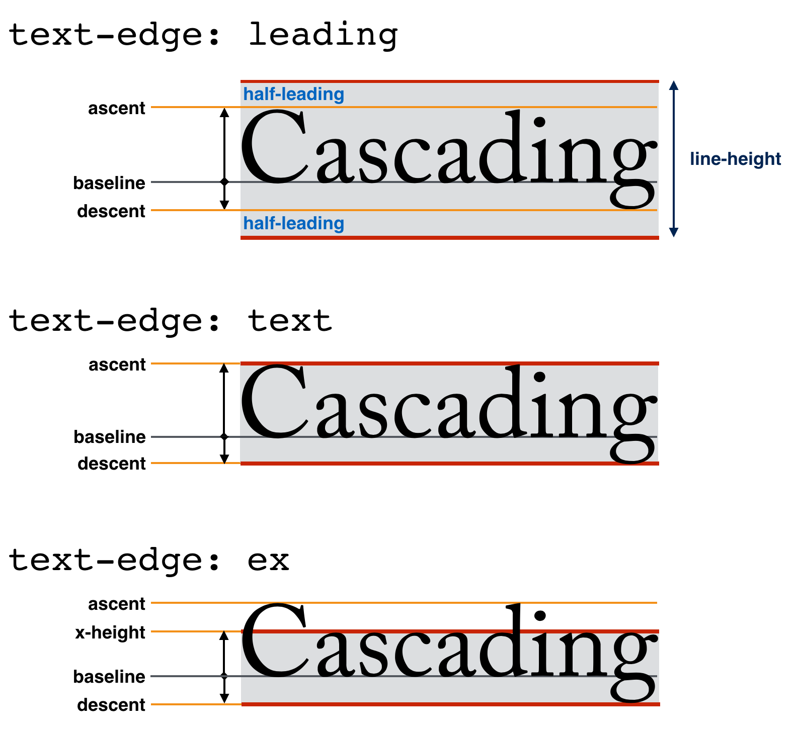
This illustration doesn’t match actual font metrics, it’s actually illustrating the cap-height, not the ascent. [Issue #11364] When line-fit-edge is leading, vertical rhythm can be broken any time there is a change in font metrics or vertical alignment within a paragraph. Other values are more likely to give consistent line spacing—as long as there is enough leading added that the half-leading on the root inline is large enough to accommodate the specified metrics of any descendants. The line box will still grow, however, to accommodate content that would otherwise overflow, to avoid overlap between lines. Note: Although only leading applies positive half-leading, in order to allow text to be set tightly, all values apply negative half-leading, see § 5.3 Calculating the Logical Height Contributions (“Layout Bounds”) of Inline Boxes. Half-leading is applied equally to both sides of the text; for more precise overlap control authors can use line-fit-edge: text together with negative margins on the affected text. 5.3. Calculating the Logical Height Contributions (“Layout Bounds”) of Inline BoxesThe contribution of an inline box to the logical height of its line box, here referred to as its layout bounds, is always calculated with respect to its own text metrics, as described below, and is controlled by line-fit-edge and line-height. The sizes and positions of child boxes do not influence its layout bounds (nor its own logical height, for that matter, see inline-sizing). Note: The layout bounds need not correspond to the box’s edges. To find the layout bounds of an inline box, the UA must first align all the glyphs directly contained in the inline box to each other by their dominant baselines. (See § 3.3 Baselines of Glyphs and Boxes.) If the inline box contains no glyphs at all, or if it contains only glyphs from fallback fonts, it is considered to contain a “strut” (an invisible glyph of zero width) with the metrics of the box’s first available font. For each glyph (including the “strut”), A represents its ascent above the baseline; D represents its descent below. Unless line-fit-edge specifies a different metric to use, A refers to the ascent metric (for the given font at its given size) and D to the descent metric, each adjusted to account for the dominant baseline’s offset from zero. If line-height computes to normal and either line-fit-edge is leading or this is the root inline box, the font’s line gap metric may also be incorporated into A and D by adding half to each side as half-leading. When its computed line-height is normal, the layout bounds of an inline box encloses all its glyphs, going from the highest A to the deepest D. (Note that glyphs in a single box can come from different fonts and thus might not all have the same A and D.) When its computed line-height is not normal, its layout bounds are derived solely from metrics of its first available font (ignoring glyphs from other fonts), and leading is used to adjust the effective A and D to add up to the used line-height. Calculate the leading L as L = line-height - (A + D). Half the leading (its half-leading) is added above A of the first available font, and the other half below D of the first available font, giving an effective ascent above the baseline of A′ = A + L/2, and an effective descent of D′ = D + L/2. However, if line-fit-edge is not leading and this is not the root inline box, if the half-leading is positive, treat it as zero. The layout bounds exactly encloses this effective A′ and D′. Note: L may be negative. Additionally, when line-fit-edge is not leading, the layout bounds are inflated by the sum of the margin, border, and padding on each side. In order to allow negative margin values to have an actual effect, negative margins are also accumulated onto the layout bounds of any descendant inline boxes participating in the same inline formatting context. In Quirks Mode [QUIRKS], any inline box fragment that has zero borders and padding and that does not directly contain text or preserved white space [CSS-TEXT-3] is ignored when sizing the line box. 6. Trimming Leading Over/Under TextTo ensure consistent spacing in the basic case of running text, CSS line layout introduces leading both above and below the text content of each line as needed to ensure its line-height. In addition, the ascent and descent font metrics themselves often include extra space above and below the most typical glyph shapes in order to accommodate occasional characters and diacritics that ascend or descend beyond the typical bounds. This prevents adjacent lines of text from overlapping each other. However, all this extra spacing interferes with visual alignment and with control over effective (visually-apparent) spacing. The text-box property allows trimming this additional space above and below the first and last lines of a block, allowing more precise control over spacing around the glyphs. By relying on font metrics rather than hard-coded lengths, this feature allows content to be resized, rewrapped, and rendered in a variety of fonts while maintaining that precise spacing. A common problem is vertical centering. It’s easy to vertically center the text container to an icon, but because the visual boundaries of Latin text are the cap height and the alphabetic baseline, rather than the ascent and descent, this often doesn’t yield the intended visual effect. 
To center the text visually, it’s necessary to assume the cap height and alphabetic baseline as the top and bottom edges of the text, respectively. 
By using text-box-trim to strip out the spacing above the cap height and below the alphabetic baseline, centering the box actually centers the text; and does so reliably, regardless of what font is used to render it. 
6.1. Shorthand for Text Box Trimming: the text-box property
This property is a shorthand for setting the text-box-trim and text-box-edge properties in a single declaration. If the single keyword normal is specified, it sets text-box-trim to none and text-box-edge to auto. Otherwise, omitting the text-box-trim value sets it to trim-both (not the initial value), while omitting the text-box-edge value sets it to auto (the initial value). 6.2. Trimming Over/Under Text: the text-box-trim property
On inline boxes, specifies whether to trim the content box to match the specified text-box-edge metric. See § 5.3 Calculating the Logical Height Contributions (“Layout Bounds”) of Inline Boxes for details. On block containers, as well as on each column of a multi-column container, specifies whether to trim half-leading at the start/end of the box’s content to better match its content edge to its text content. The trimming edge in this case is specified by the start/end text-box-edge value of the affected line box’s containing block. Values have the following meanings:
Note: Like ::first-line, this property does not apply to, or propagate through, flex, grid, or table formatting contexts. Note: The block-end side does not coincide with the line-under side when writing-mode is vertical-lr. If multiple ancestors specify trimming on the same line box, the metric used is that of the innermost block container that requests trimming on that side of the line box. Note: Content and ink overflowing a box due to non-initial values of text-box-trim is handled the same as content that would overflow the box or line box otherwise. Unlike ::first-line, when applying to the first (or last) formatted line of a multi-column container, this property applies to the first (or last) formatted lines of every column in the multi-column container. What happens if the column is split by a spanner? [Issue #11363] When the box to which text-box-trim has been applied is split by fragmentation [CSS-BREAK-3], whether trimming is applied per fragment or only to the start/end edges of its first/last fragments is determined by box-decoration-break. If, when printing, trimming a line box would cause its content to be clipped, the UA may ignore text-box-trim on that edge of that line box. 6.3. Text Trimming Metrics: the text-box-edge property
This property specifies the metrics to use for text-box-trim effects. Values have the same meanings as for line-fit-edge; the auto keyword uses the value of line-fit-edge, interpreting leading (the initial value) as text. Note: This property can be set together with text-box-trim in the text-box shorthand. Unlike line-fit-edge, it does not inherit; however its initial value copies from line-fit-edge, which does inherit. 6.4. Inline Box Drawing Height: the inline-sizing property
This has a confusing name. We need a new name. Alternatively, incorporate this into text-box-trim? [Issue #5189] This property specifies how the logical height of the content area of an inline box is measured in relation to its contents. It has no effect on the size or position of the box’s contents, the line box, or any other content. Values have the following meanings:
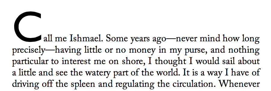
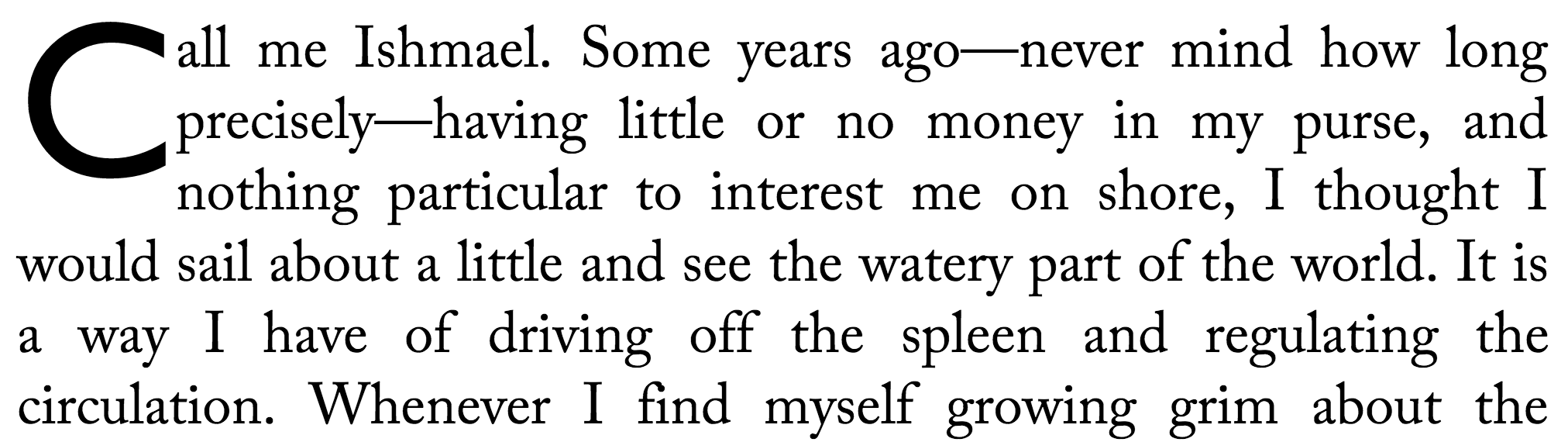
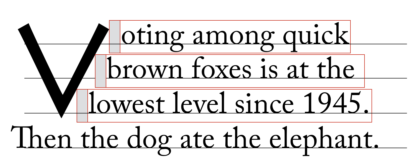
Note: The height property does not apply to inline boxes. Note: The line-height has no impact on the size of an inline box, it only affects its contribution to the logical height of its line box. 7. Initial LettersThe editors would appreciate any examples of drop initials in non-western scripts, especially Indic scripts. 7.1. An Introduction to Initial LettersThis section is non-normative. Large, decorative letters have been used to start new sections of text since before the invention of printing. In fact, their use predates lowercase letters entirely. 7.1.1. Drop InitialA dropped initial (or “drop cap”) is a larger-than-usual letter at the start of a paragraph, with a baseline at least one line lower than the first baseline of the paragraph. The size of the drop initial is usually indicated by how many lines it occupies. Two- and three-line drop initials are very common. 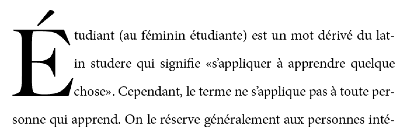
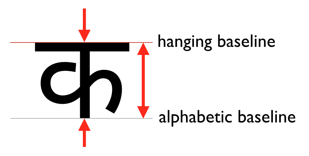
The exact size and position of a dropped initial depends on the alignment of its glyph. Reference points on the drop cap must align precisely with reference points in the text. The alignment constraints for drop initials depend on the writing system. In Western scripts, the top reference points are the cap height of the initial letter and of the first line of text. The bottom reference points are the alphabetic baseline of the initial letter and the baseline of the Nth line of text. The figure below shows a simple two-line drop cap, with the relevant reference lines marked. 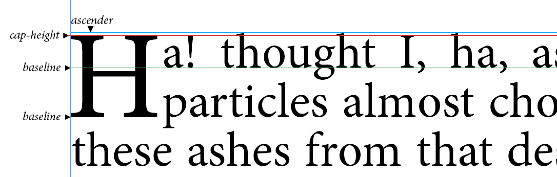
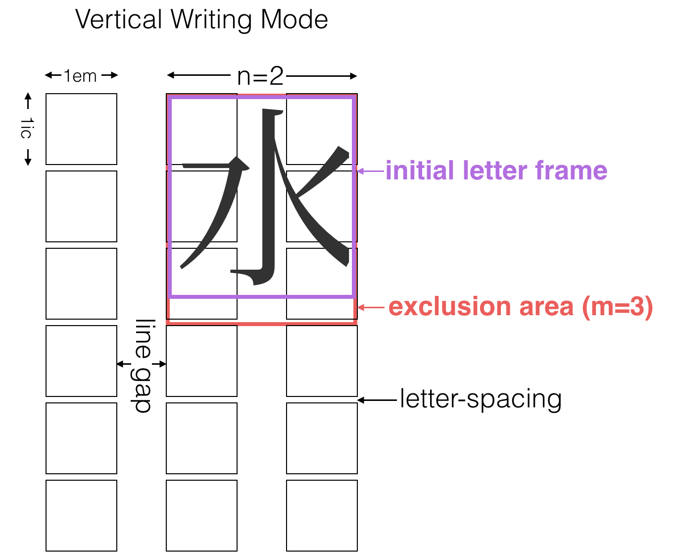
In Han-derived scripts, the initial letter extends from the block-start edge of the glyphs on the first line to the block-end edge of the glyphs on the Nth line. 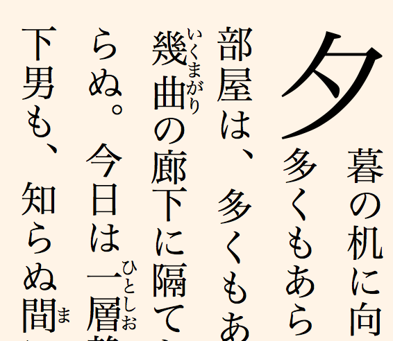
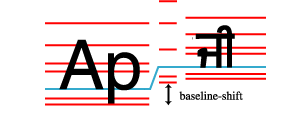
In certain Indic scripts, the top alignment point is the hanging baseline, and the bottom alignment point is the text-after-edge. 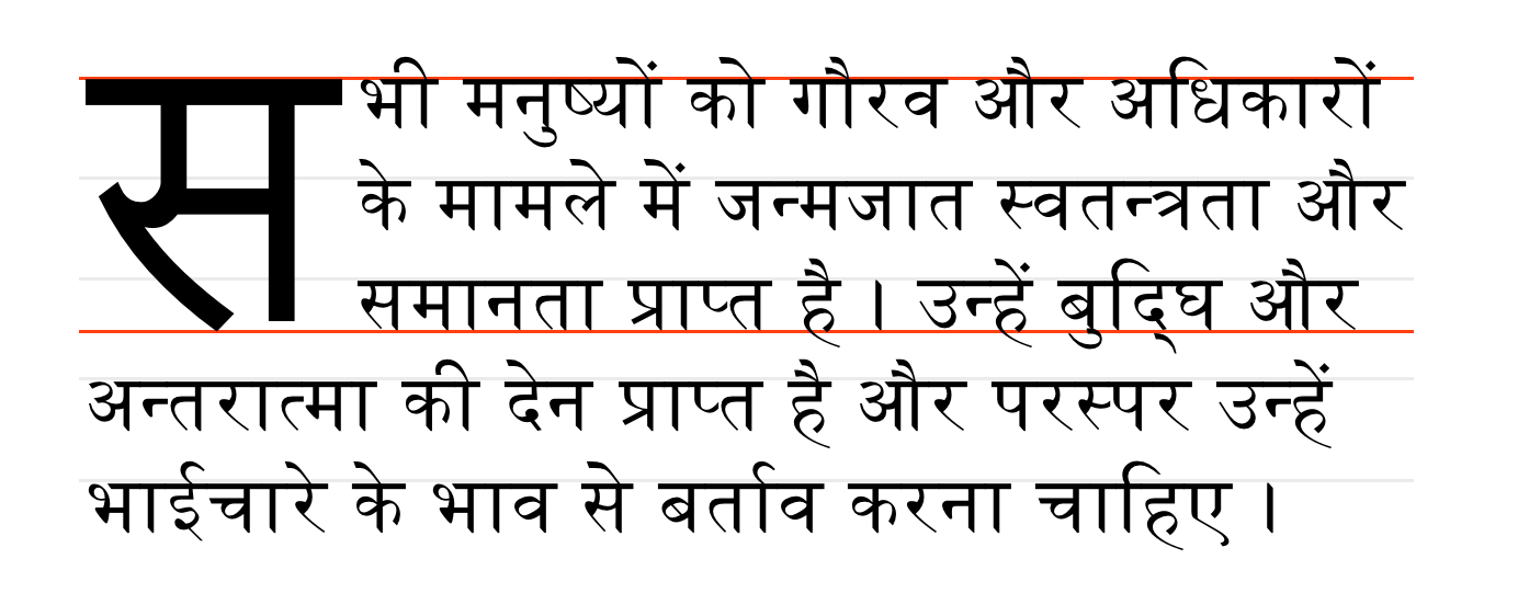
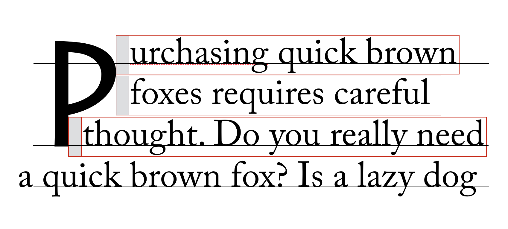
7.1.2. Sunken Initial LettersSome styles of drop initials do not align with the first line of text. A sunken initial (or “sunken cap”) both sinks below the first baseline, and extends above the first line of text. 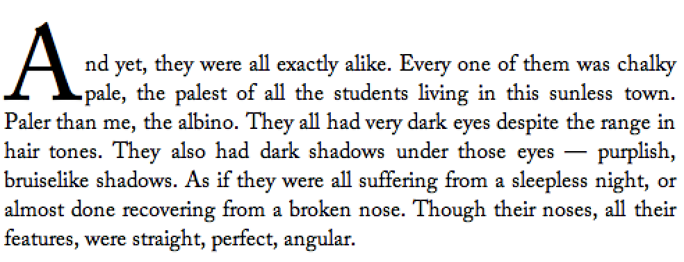
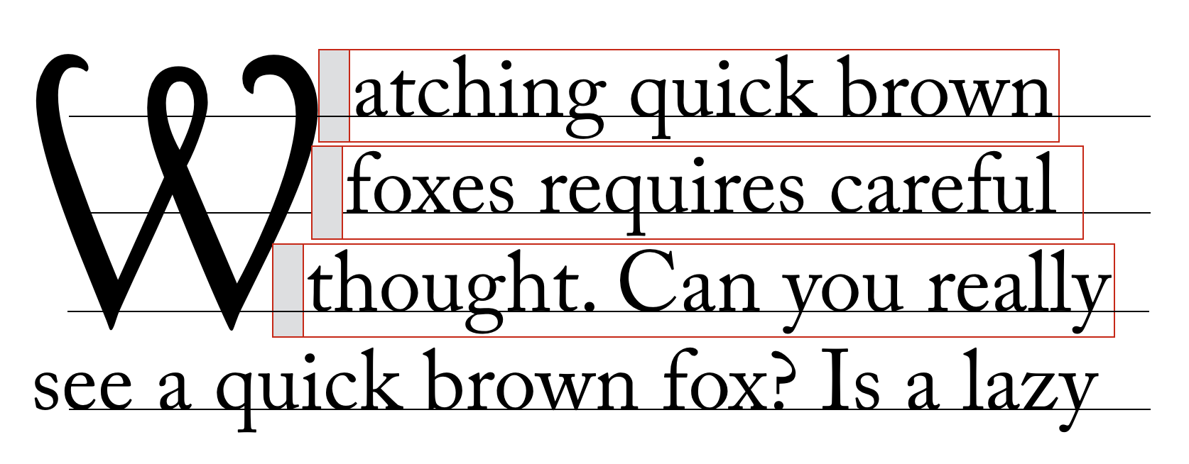
7.1.3. Raised Initial LettersA raised initial (often called a “raised cap” or “stick-up cap”) “sinks” to the first text baseline. Note: A proper raised initial has several advantages over simply increasing the font size of a first letter. The line spacing in the rest of the paragraph will not be altered, but text will still be excluded around large descenders. And if the size of raised initial is defined to be an integral number of lines, implicit baseline grids can be maintained. 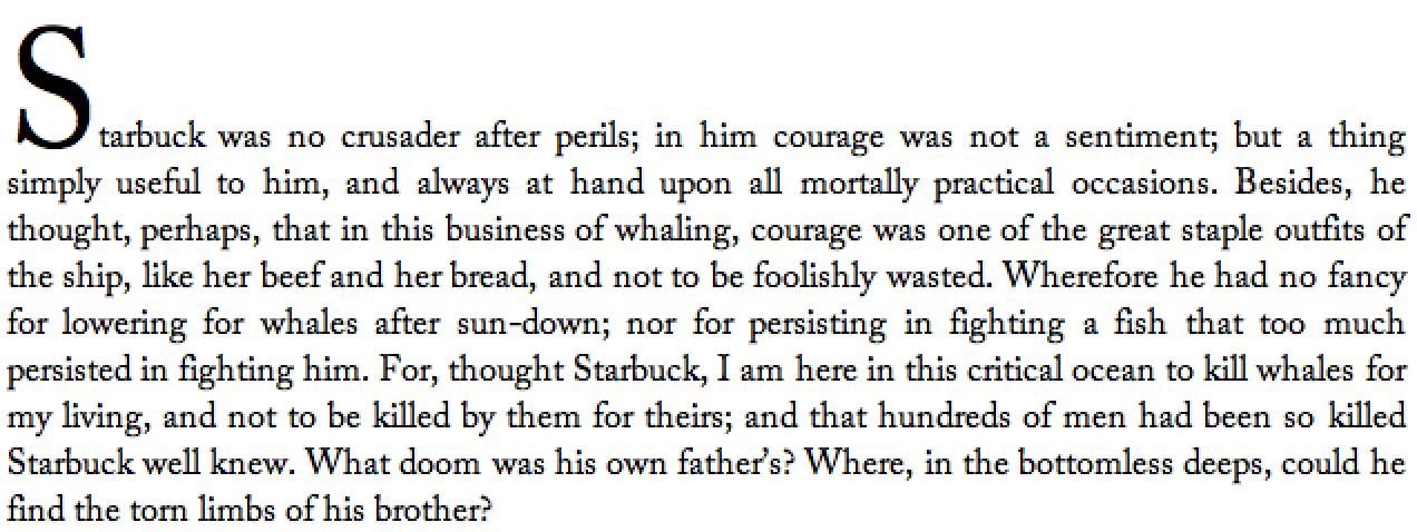
7.2. Selecting Initial LettersThis section is non-normative. Initial letters are typically a single letter, although they may include punctuation or a sequence of characters which are perceived by the user to be a single typographic unit. The ::first-letter pseudo-element, defined in [SELECT] and [CSS-PSEUDO-4], can be used to select the character(s) to be formatted as initial letters. Authors who need more control over which characters are included in an initial letter, or who want to apply initial-letter formatting to replaced elements or multiple words can alternately apply the initial-letter property to the first inline-level child of a block container. <p>This paragraph has a dropped “T”. <p><img alt="H" src="illuminated-h.svg">ere we have an illuminated “H”. <p><span>Words may also</span> be given initial letter styling at the beginning of a paragraph. ::first-letter, /* style first paragraph's T */
img, /* style illuminated H */
span /* style phrase inside span */
{ initial-letter: 2; }
Note that since ::first-letter selects punctuation before or after the first letter, these characters are included in the initial letter when ::first-letter is used. 
Should there be a way to opt out of this behavior? See GitHub Issue 310. 7.3. Creating Initial Letters: the initial-letter property
This property specifies the size and sink for dropped, raised, and sunken initial letters as the number of lines spanned.
For example, the following code will create
a 2-line dropped initial letter
at the beginning of each paragraph
that immediately follows a second-level heading:
h2 + p::first-letter { initial-letter: 2; }
It takes the following values:
If the initial letter sink value is omitted, drop is assumed. Values other than normal cause the affected box to become an initial letter box, which is an in-flow inline-level box with special layout behavior.
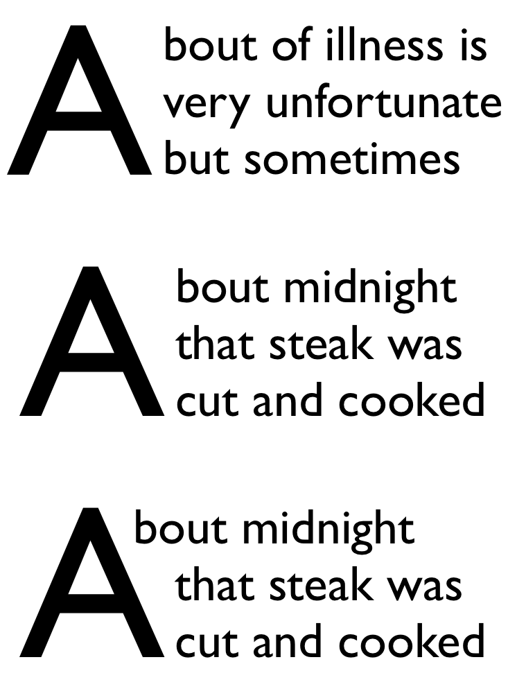
Here are some examples of initial-letter usage:
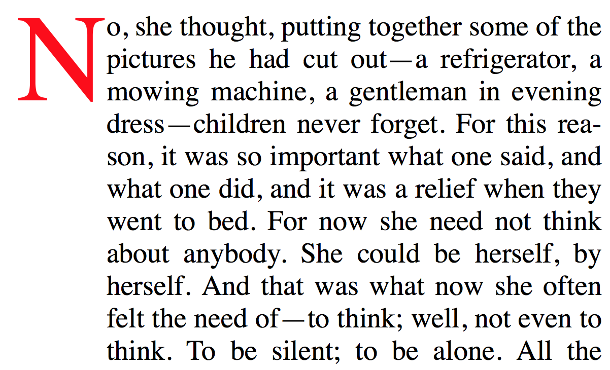
In conjunction with other CSS properties, initial-letter can be used to create
“adjacent initial letters,” where the initial letter is adjacent to the text:
p::first-letter {
  initial-letter: 3;
  color: red;
  width: 5em;
  text-align: right;
  margin-left: -5em;
}

p {
  margin-left: 5em;
}
7.3.1. ApplicabilityTo give authors more control over which characters can be styled as an initial letter and to allow the possibility of multi-character initial letters (such as for first word or first phrase styling), the initial-letter property applies not just to the CSS-defined ::first-letter pseudo-element, but also to inside-positioned ::marker pseudo-elements and to inline-level boxes that are placed at the start of the first line. Specifically, initial-letter applies to any inline-level box—including any such ::first-letter or ::marker box—that is the first child of its parent box and whose ancestors (if any) that are descendants of its containing block are all first-child inline boxes that have a computed initial-letter value of normal.
For example,
the
<span>, <em>, and <b> elements
in the following example are
"first-most inline-level descendants" of the <p>,
but the <strong> element
is not:
<p><span><em><b>This</b> phrase</em> is styled
<strong>specially</strong>.</span> …
If we apply the following rules: em { initial-letter: 2; }
b, strong { initial-letter: 3; }
The initial-letter property will take effect only on the The result might be rendered as 
If initial-letter is applied to an inline-level box that is not positioned at the start of the line due to bidi reordering or which is otherwise preceded by other inline-level content, its used value is normal, and it is not formatted as an initial letter. The effect of the initial-letter property is undefined on children of ruby base container boxes and on ruby container boxes. Note: The initial-letter property cannot apply to any element whose float is not none or position is not static, because these values cause its display to compute to block. 7.4. Alignment of Initial Letters: the initial-letter-align propertyAs mentioned earlier, the alignment of initial letters depends on the script used. The initial-letter-align property can be used to specify the proper alignment.
This property specifies the alignment points used to size and position an initial letter. Two sets of alignment points are necessary: the over and under alignment points of the initial letter are matched to corresponding over and under points of the root inline box. Values have the following meanings:
The vertical writing mode example earlier
(in § 7.1 An Introduction to Initial Letters)
could be coded as:
span.initial {
  initial-letter: 2;
  initial-letter-align: ideographic;
}
Except when border-box is specified, the alignment points of the initial letter are automatically determined from its contents:
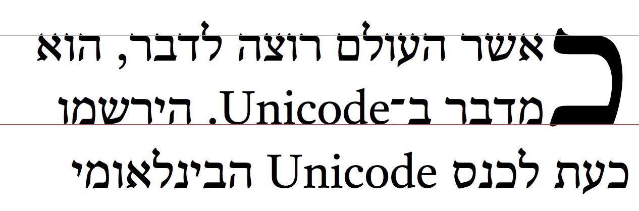
Correct alignment of initial letter in scripts such as Hebrew and Thai
is currently not possible because OpenType lacks corresponding metrics.
(Issue 5244)
Note: The ordering of keywords in this property is fixed in case border-box is expanded to [ border-box | alphabetic | ideographic | hanging ] to allow explicitly specifying the initial letter’s alignment points. 7.4.1. UA Default Stylesheet for initial-letter-alignIn order to provide the better behavior by default, UAs must include in their default UA style sheet the following rules: [lang]:lang(zh, ja, ko, ii) {
initial-letter-align: ideographic;
}
[lang]:lang(hi, mr, ne, pi, kok, brx, mai, sd, sa) {
initial-letter-align: hanging;
}
/* Script tags override language tags */
[lang]:lang('*-Latn', '*-Cyrl') {
initial-letter-align: alphabetic;
}
[lang]:lang('*-Hani', '*-Hant', '*-Hans') {
initial-letter-align: ideographic;
}
This only covers the most common cross-linguistic transcription systems. Should we include any other / all script tags in the UA style sheet? 7.5. Initial Letter LayoutThere are two types of initial letter boxes: those that arise from non-replaced inline boxes and those that arise from atomic inlines. For the non-atomic inline initial letter, the box and its contents participate in the same inline formatting context as the line on which it occurs, and a lot of special rules apply to give the expected sizing and alignment. For an atomic initial letter, however, which is either a replaced element or which establishes an independent formatting context for its contents, the sizing of the box (aside from its automatic size in the block axis) and layout of the contents within the box follows the usual rules: it is primarily the positioning of the box which is special. 7.5.1. Properties Applying to Initial LettersAll properties that apply to an inline box also apply to an inline initial letter except for vertical-align and its sub-properties, font-size, line-height, line-fit-edge, and inline-sizing. Additionally, all of the sizing properties and box-sizing also apply to initial letters (see [css-sizing-3]). All properties that apply to an atomic inline also apply to the atomic inline when styled as an initial letter, except for vertical-align and its sub-properties. 7.5.2. Margins, Borders, and PaddingInitial letters can be styled with margins, padding, and borders just like any other box. Unless initial-letter-align is border-box, its vertical alignment and font sizing are not affected. However the effective exclusion area, which is typically the initial letter’s margin box (see initial-letter-wrap) is affected. When padding and borders are zero, the initial letter may be kerned; see below. 7.5.3. Font Sizing of Initial LettersFor an inline initial letter, the font size used for sizing the initial letter contents is calculated to fulfill its specified size (see initial-letter) as anchored by its specified alignment points (see initial-letter-align). Note that no layout is required in this calculation: it is based only on computed values and font metrics. These used font size calculations do not affect the computed font-size, and therefore have no effect on the computation of em length values, etc. What about inheritance to descendants? [Issue #4988] The line height used in these calculations is the line-height of the containing block (or, in the case where a baseline grid is in use, the baseline-to-baseline spacing required by the baseline grid [CSS-LINE-GRID-1]). The contents of the lines spanned, and therefore any variation in their heights and positions, is not accounted for. 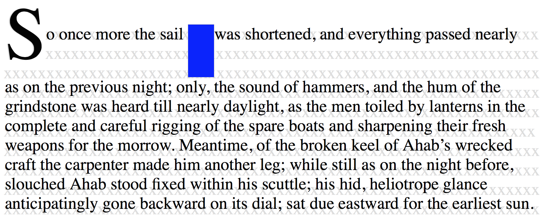
For an N-line drop initial in a Western script, the cap-height of the letter needs to be (N – 1) times the line-height, plus the cap-height of the surrounding text. Note this height is not the font size of the drop initial. Actually calculating this font size is tricky. For an N-line drop initial, we find the drop initial font size to be: 
Update this calculation to be a) generic across writing systems / alignment points and b) handle non-integer sizes.
A three-line drop initial in Adobe Minion Pro
would have a font size of 61.2pt given
12pt text, 16pt line-height, and a cap-height of 651/1000 (from the font’s OS/2 table).
For an atomic initial letter, the used font size is the computed font size as usual. 7.5.4. Shaping and Glyph SelectionWhen initial-letter is not normal, an inline initial letter is isolated for glyph shaping; however the text after it should shape across the inline initial letter box’s boundaries, assuming its presence as part of the first line’s text content. (See CSS Text 3 § 7.3 Shaping Across Element Boundaries.) For example, if the first letter of the word “يحق” were styled with initial-letter: 2 1, the first letter would be styled in its isolated form “ي”, as the initial letter, followed by the medial/final-form “ﺤﻖ”, which assumes it is preceded by the initial letter’s contents as normal text. 
7.5.5. Sizing the Initial Letter BoxFor an inline initial letter, if the initial letter’s preferred width/preferred height is definite, use that value (clamped as required by the min size and max size properties, and handling box-sizing as required) for that dimension of the box. Otherwise it is considered to have an automatic size in that dimension and its content box is sized to fit both:
However, if its block-start padding and border are both zero, then its block-start content edge instead coincides with its over alignment point exactly, and any content overflowing above that point is ignored for the purpose of layout. Note: If an inline initial letter has ascenders above its over alignment point, and the author has not provided sufficient margin on either the initial letter itself or its containing block, then those ascenders might collide with preceding content. Note: It might be nice to automatically provide the necessary spacing by treating such ascenders as a margin that can collapse with the margin of the containing block, and thus guarantee the requisite spacing without imposing any additional space unless it becomes actually necessary. Depending on implementation complexity, this option may be explored in the future; but in the meantime, authors need to be careful to provide the requisite spacing explicitly. Should the hanging punctuation be included in the box instead (so that the box is drawn around the punctuation when it is made visible through borders/background), but rather only excluded when positioning the box (so that the initial letter remains flush, with the hanging punctuation properly hanging)? See discussion. For atomic initial letters, sizing follows the usual rules for that type of atomic inline. However, if the box has an automatic block size (auto), then its block size is determined as for an inline initial letter with border-box alignment, and is definite. 7.5.6. Alignment Within an Initial Letter BoxBy default (i.e. under automatic sizing), the content box of an inline initial letter is fitted exactly to its content, and alignment properties like text-align or align-content do not apply. However, if the box is not sized automatically:
7.6. Initial Letter Positioning and Spacing7.6.1. Block-axis PositioningIn the block axis, the initial letter is positioned with respect to the line box in which it originates as required to satisfy its alignment (initial-letter-align) and specified sink (initial-letter):
Note: An initial letter is essentially positioned such that it would sink the number of lines specified by initial-letter’s second argument and align to the requisite under alignment point (or, if its size is less than its sink, to the requisite over alignment point instead) if it was assumed that its containing block held only the initial letter itself followed by an infinite sequence of plain text as the direct contents of its root inline box. Its position is not affected by line height inconsistencies introduced by the contents of the impacted line boxes.
The initial letter does not increase the logical height of the line box in which it participates: it can protrude above or below it. It must be positioned such that its own block-start margin edge is below its containing block’s block-start content edge, and thus can force its originating line box (and subsequent content) to shift further away from that edge. 7.6.2. Inline KerningIf the initial letter is a non-atomic inline with an automatic inline size and zero padding and borders, its margin box is kerned (negatively inset) by the distance from the start edge of its content box to the point in the content that would have been placed at the start edge of the line box if it were not an initial letter (i.e. the distance between its glyph bounding box and its start side bearing). This inset is effectively an additional inline-start margin on the box. 7.7. Initial Letter Wrapping: the initial-letter-wrap propertyNote: initial-letter-wrap is at risk.
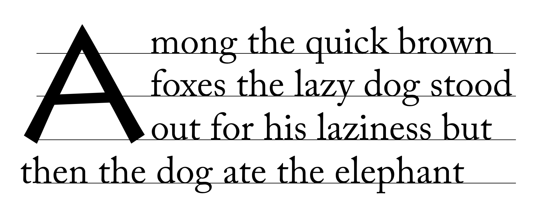
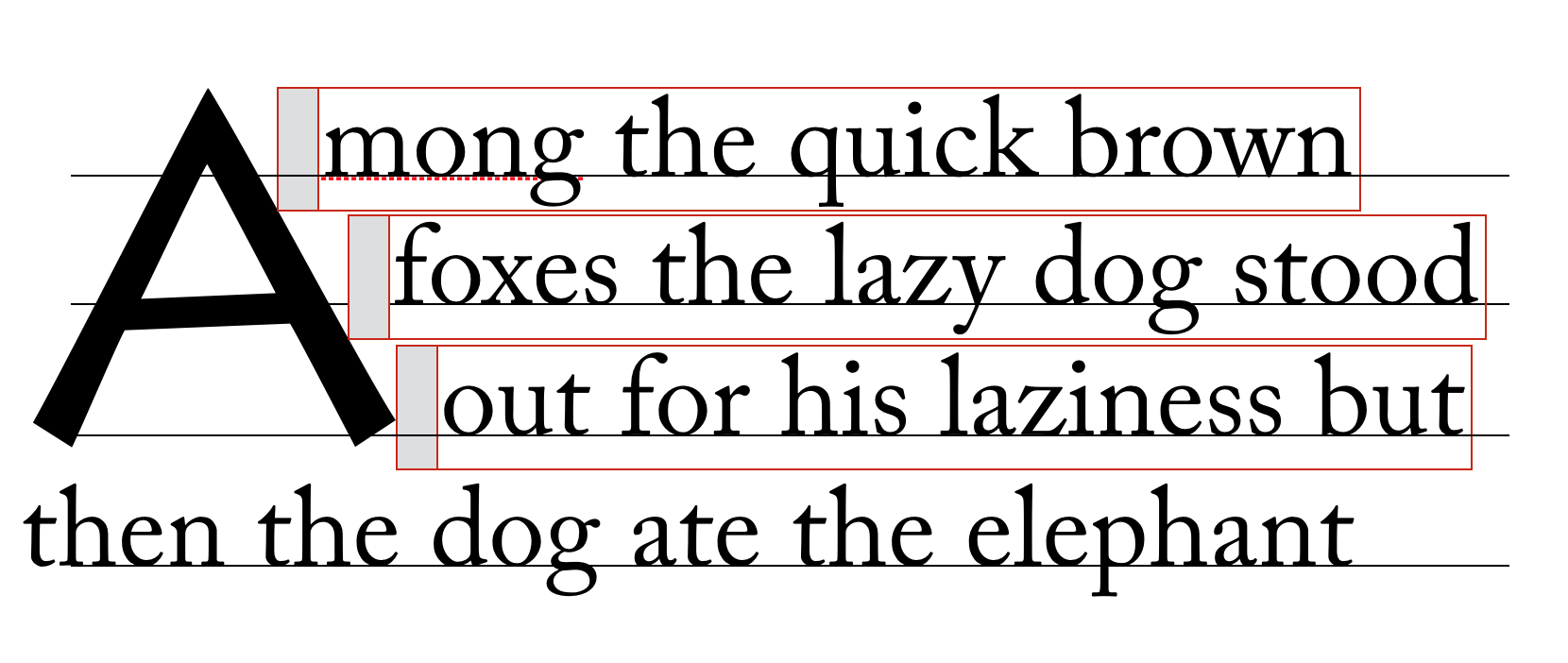
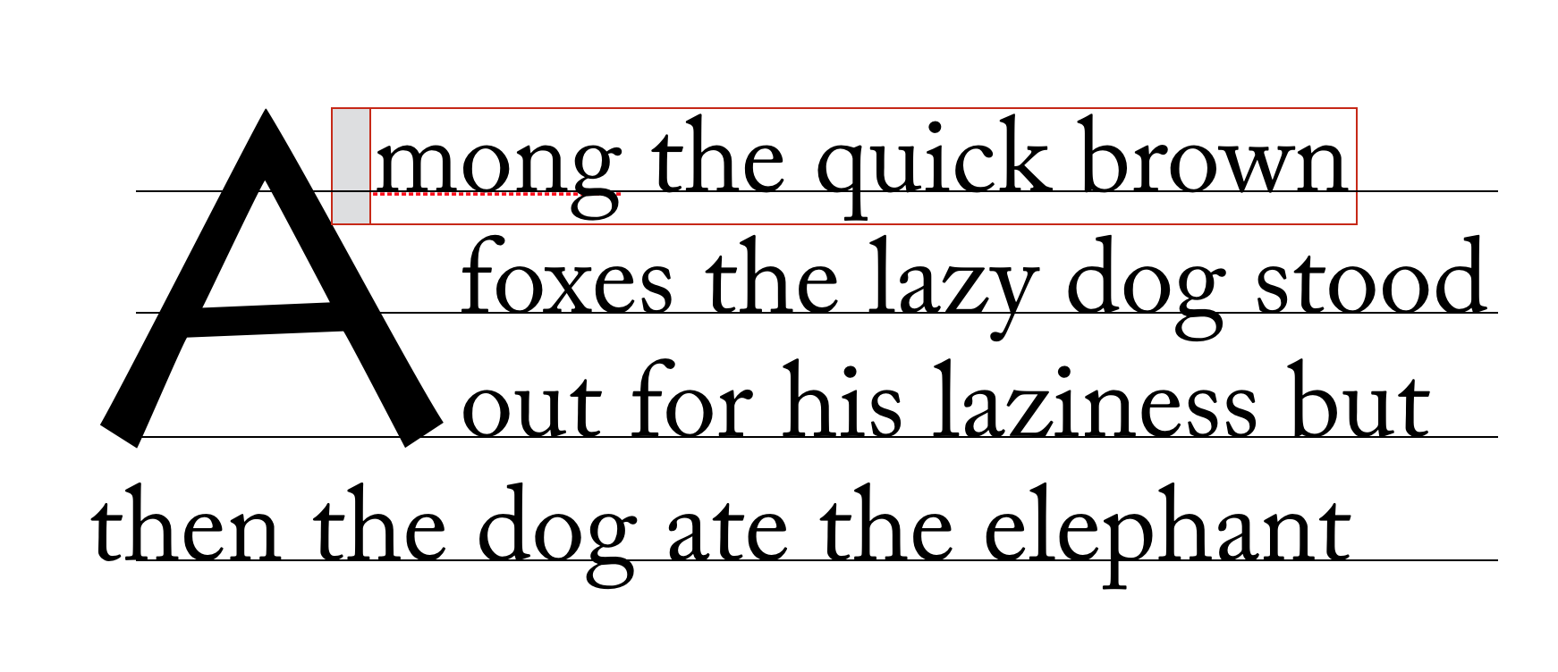
This property specifies whether lines impacted by an initial letter are shortened to fit the rectangular shape of the initial letter box or the contour of its glyph outline.
Edit figure to show how auto behaves in varying contexts p::first-letter {
initial-letter: 3;
initial-letter-wrap: none;
}
p::first-letter {
  initial-letter: 3;
  initial-letter-wrap: all;
}
p::first-letter {
  initial-letter: 3;
  initial-letter-wrap: first;
}
7.8. Line LayoutAn initial letter box is considered in-flow in its block formatting context, and is part of the contents of the line box in which it originates (its originating line box). Aside from the vertical axis (see § 7.6.1 Block-axis Positioning), its interaction with the rest of the contents of the line is as normal for inline-level content, except in a few specific details… 7.8.1. Inline Flow Layout: Alignment, Justification, and White SpaceAn initial letter box is handled similar to any other inline-level content participating in its originating line box, including participation in alignment, justification, and white space processing. However, to ensure consistent alignment of all the impacted lines, collapsible white space between a sunken initial and subsequent content on its originating line is collapsed away, and any letter-spacing or justification opportunity that would normally be introduced by the juxtaposition of the contents of a sunken initial and the subsequent contents of the line is suppressed. (Note that this does not affect word-spacing or the justification opportunity introduced by a word separator because that space is provided by the typographic character unit alone and not by its juxtaposition with an adjacent character.) 7.8.2. Edge Effects: Indentation and Hanging Punctuationtext-indent and hanging-punctuation apply to an initial letter’s originating line box as usual, and cause a shift in the start of the line’s contents including the initial letter itself. Subsequent lines affected by the exclusion are shortened as usual, possibly more or less than otherwise depending on the resulting position of the initial letter. 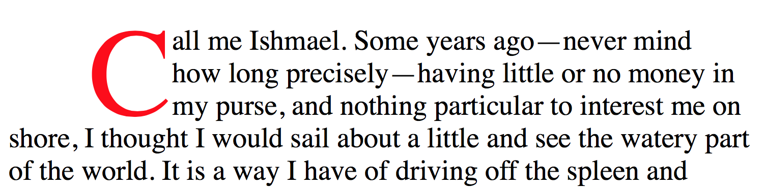
The interaction of initial-letter and hanging-punctuation is under discussion. 7.8.3. Ancestor InlinesIf the initial letter box is contained by inline box ancestors, the boundaries of those inline boxes are drawn to exclude the initial letter box, as if it were outside their startmost margin edge. This is a purely geometric operation: it does not affect e.g. property inheritance or the effective letter-spacing between the initial letter box and subsequent content. 7.8.4. Multi-line Initial LettersIf an initial letter is too long to fit on one line, it wraps (according to the usual text-wrapping rules), each line filled and formatted exactly as if it were the first line and the initial letter too long to fit any subsequent normal text. Any normal text after the initial letter starts on its last line, affected exactly as if that line were the first line. 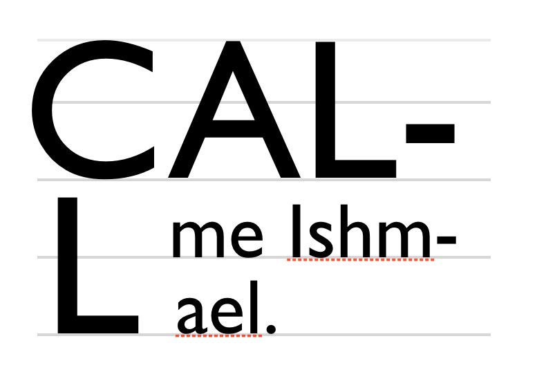
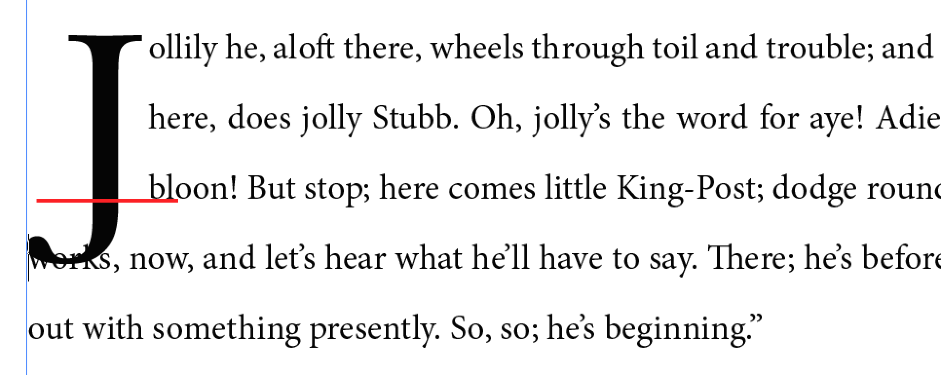
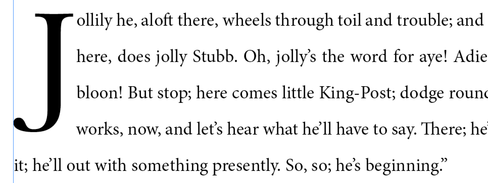
7.9. Clearing Initial Letters7.9.1. Raised and sunken capsThe margin box of an initial letter contributes to the size of its containing element. Initial letters that extend above the first line of text, known as “raised caps” or “sunken caps,” do not extend up into previous elements. Since the content box for an initial letter includes all glyph ink, this also means that accents or other ink above the cap height of an initial letter will not impinge on previous elements. 
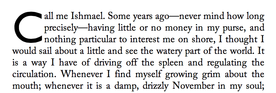
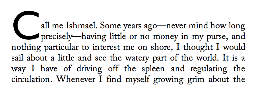
initial-letter: 3 1) on right;
note that the position of the “C” is the same in both cases,
but on the right all text is moved down relative to the initial letter.
Handle glyph ink above cap height of font. Proposal: Make it an exclusion area for line boxes and border boxes. Include margin specified on initial-letters as part of exclusion area in order to control spacing. Draw a box model diagram here. Does the margin of the initial letter collapse with its container? 7.9.2. Short paragraphs with initial lettersA paragraph with an initial letter can have fewer lines of text than the initial letter occupies. In this case, the initial letter’s top alignment is still honored, and its exclusion area continues into any subsequent blocks. This forces the subsequent inline-level content to wrap around the initial letter—exactly as if that block’s text were part of its own containing block. (This is similar to how floats exclude content in subsequent block boxes.) 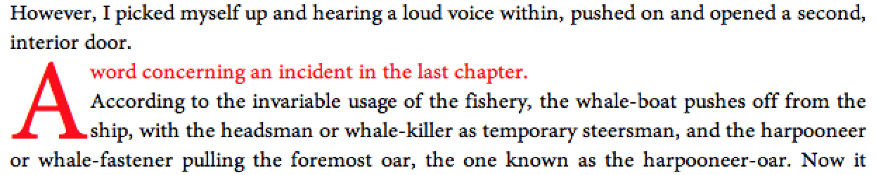
If the subsequent block starts with an initial letter, establishes an independent formatting context, or specifies clear in the initial letter’s containing block’s start direction, then it must clear the previous block’s initial letter. 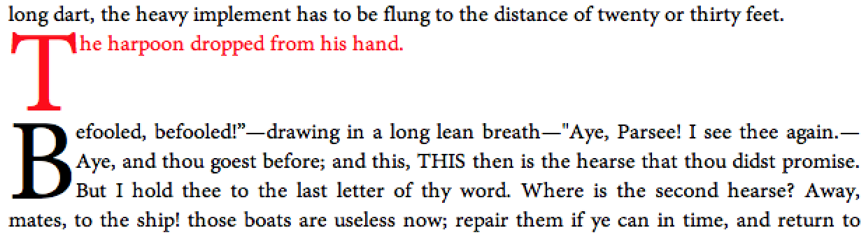
7.9.3. Interaction with floatsInitial letters are not floats: they are in-flow inline-level content that belongs to a line box. Therefore:
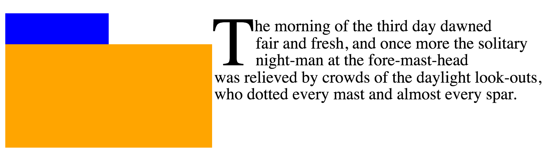
See CSS2§9.5 for more information about the layout of floats and adjacent content. [CSS2] Whether an inline-end float originating in subsequent lines must clear the initial letter (as inline-start floats do) is still under discussion. There is no aesthetic reason to require it; however it’s yet unclear how the underlying layout model would distinguish between the two cases. 7.9.4. Interaction with Fragmentation (Pagination)Since a single glyph cannot be fragmented across pages (or columns or other fragmentation containers), an initial letter is considered monolithic [CSS-BREAK-3] for the purpose of block-axis fragmentation (breaking across pages, columns, regions, etc.). Additionally, breaks between the in-flow lines alongside an initial letter box are avoided, much as breaks between line boxes affected be widows and orphans are avoided. However, if there is a forced break alongside the initial letter box, then it takes precedence; but has no effect on the initial letter box itself. As with other monolithic objects, if an initial letter box occurs at the top of a fragmentation container and that fragmentation container is too short to contain it, it may be either truncated or sliced. Adjacent content, however, must be fragmented according to its own rules, not truncated or sliced along with the initial letter. Appendix A: Synthesizing Alignment MetricsA.1: Calculating Em-over and Em-underNote: The em-over and em-under baselines are not used by CSS. Their definitions are included in this module for consistency with the other metrics used by Canvas TextMetrics API. The em-over and em-under metrics are calculated as follows:
Note: This calculation ensures that em-over and em-under are always exactly 1em apart while trying to center the glyph outlines’ “center of gravity” between them. A.2: Synthesizing Baselines (and Other Font Metrics) for TextSome fonts might not contain the metrics information necessary to align text properly as described in this module. User agents may use the following strategies in the absence of a required metric:
A.3: Synthesizing Baselines for Atomic InlinesIf an atomic inline (such as an inline-block, inline-table, or replaced element) does not have a content-derived baseline set in the inline axis of the inline formatting context in which it participates, then the UA must synthesize its baselines as follows in order to align it. These baselines are assumed to be at its line-under margin edge: These baselines are assumed to be halfway between its line-under and line-over margin edges: These baselines are assumed to be at its line-over margin edge:
Note: Authors can use margins (positive or negative) to adjust the alignment of replaced content within a line.
In this example, the author is using a set of images
to display characters that don’t exist.
img[src^="/text/"] {
  height: 1em; /* Size to match adjacent text */
  margin-bottom: -0.2em; /* Baseline at 20% above bottom */
}
...
<p>This is some text with words written in an unencoded script:
<img src="/text/ch3439.png" alt="...">
  <img src="/text/ch3440.png" alt="...">
  <img src="/text/ch3442.png" alt="...">
Note: A future level of CSS may include a way of specifying a full baseline table for replaced elements. (This will probably look like a baseline-table property that accepts [<baseline-keyword> <percentage>]+.) ChangesChanges since the 18 December 2024 Working Draft:
Changes since the 12 August 2024 Working Draft:
Changes since the 8 August 2024 Working Draft:
Changes since the 1 April 2023 Working Draft:
Changes since the 14 November 2022 Working Draft:
Changes since the 28 August 2020 Working Draft:
Changes since the 18 June 2020 Working Draft include:
Changes since the 4 June 2020 Working Draft include:
Changes since the 8 August 2018 Working Draft include:
See also earlier changes since the 24 May 2016 Working Draft. AcknowledgmentsSpecial thanks goes to the initial authors, Eric A. Meyer and Michel Suignard. In additions to the authors, this specification would not have been possible without the help from: David Baron, Mike Bremford, David M Brown, Oriol Brufau, John Daggett, Stephen Deach, Sylvain Galineau, David Hyatt, Myles Maxfield, Shinyu Murakami, Jan Nicklas, Tess O’Connor, Sujal Parikh, Florian Rivoal, Alan Stearns, Weston Thayer, Bobby Tung, Chris Wilson, Grzegorz Zygmunt. Privacy ConsiderationsNo new privacy considerations have been reported on this specification. Security ConsiderationsNo new security considerations have been reported on this specification. | |||||||||||||||||||||||||||||||||||||||||||||||||||||||||||||||||||||||||||||||||||||||||||||||||||||||||||||||||||||||||||||||||||||||||||||||||||||||||||||||||||||||||||||||||||||||||||||||||||||||||||||||||||||||||||||||||||||||||||||||||||||||||||||||||||||||||||
| You are visitor 01402503 — GeezerVison does not store the pages you look up. Best viewed with Netscape Navigator 4.7 or Internet Explorer 6 at 800×600. No cookies required. |