Tkinter is Python’s built-in library for creating graphical user interfaces (GUIs). It acts as a lightweight wrapper around Tcl/Tk GUI toolkit, offering Python developers a simple and intuitive way to build desktop applications. It supports layout management, event handling and customization, making it ideal for rapid GUI development in Python.
Create First Tkinter GUI Application
There are two main methods used which user needs to remember while creating the Python application with GUI. These methods are:
1. Tk()
In Tkinter, the Tk() class is used to create the main application window. Every Tkinter program starts by creating exactly one Tk() object.Below is the syntax:
screenName (optional): Specifies the display (mainly used on Unix systems with multiple screens).
baseName (optional): Sets the base name for the application (default is the script name).
className (optional): Defines the name of the window class (used for styling and window manager settings).
useTk (optional): A boolean that tells whether to initialize the Tk subsystem (usually left as default 1).
2. mainloop()
The mainloop() method starts the event loop of a Tkinter application. It keeps the window open, waits for user actions (like mouse clicks or key presses), and processes events until the window is closed. Below is the syntax:
root.mainloop()
Example: This example creates a basic Tkinter window and starts the event loop.
Python
importtkinterastkroot=tk.Tk()# Widgets are added hereroot.mainloop()
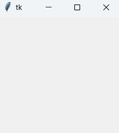
Output
Explanation:
tk.Tk(): Creates the main application window.
root.mainloop(): Starts the event loop and keeps the window responsive.
The program stops only when the window is closed.
Tkinter Widget
There are a number of tkinter widgets which we can put in our tkinter application. Some of the major widgets are explained below:
1. Label
The Label widget is used to display text or images in a Tkinter window. It is commonly used for showing messages, titles, or instructions.Below is the syntax:
label = tk.Label(master, option=value)
Parameter:master refers to the parent window or container in which the label is placed.
Example: This example creates a simple window and displays a text label.
A window appears displaying the text “GeeksForGeeks.org!”.
Explanation: label.pack() places the label inside the window.
Note: Tkinter widgets support many options such as font, bg (background) and fg (foreground). Only a few commonly used options are shown in the examples.
2. Button
The Button widget is a clickable component used to perform an action when pressed, such as submitting data or closing a window.Below is the syntax:
button = tk.Button(master, option=value)
Example: This example creates a window titled “Counting Seconds” with a Stop button. When the button is clicked, the application closes.
A window with a Stop button is displayed. Clicking the button closes the window.
Explanation:
tk.Button(): Creates a button widget.
command=root.destroy: Closes the application when the button is clicked.
button.pack(): Places the button in the window.
3. Entry
The Entry widget is used to accept single-line text input from the user. For multi-line text input, the Text widget is used instead.Below is the syntax:
entry = tk.Entry(master, option=value)
Example: This example creates a simple form with First Name and Last Name input fields. The grid() geometry manager is used to arrange labels and entry boxes in a table-like layout.
A window appears with two labeled text fields for First Name and Last Name.
Explanation:
tk.Entry(): Creates a single-line text input box.
grid(): Arranges widgets in rows and columns.
4. CheckButton
The Checkbutton widget is used to create a checkbox that can be toggled on or off. It is usually linked to a variable to store its current state.Below is the syntax:
check = tk.Checkbutton(master, option=value)
Example: This example creates a window with two checkboxes labeled Male and Female. Each checkbox is connected to an IntVar() that stores its state (1 for checked, 0 for unchecked).
A window appears with two checkboxes arranged vertically.
Explanation:
tk.IntVar(): Stores the checkbox state (1 or 0).
grid(): Aligns widgets in rows and columns.
sticky=tk.W: Aligns the checkbox to the left.
5. Radiobutton
The Radiobutton widget allows the user to select exactly one option from a group of choices. All radio buttons in a group share the same variable.Below is the syntax:
radio = tk.Radiobutton(master, option=value)
Example: This example creates two radio buttons labeled A and B. Only one option can be selected at a time.
A window appears showing a list of programming languages.
Explanation:
tk.Listbox(): Creates a list container.
insert(): Adds items to the listbox.
pack(): Displays the listbox in the window.
7.Scrollbar
The Scrollbar widget provides a scrolling mechanism for widgets such as Listbox, Text, or Canvas. It is used when the content is larger than the visible area.Below is the syntax:
scrollbar = tk.Scrollbar(master, option=value)
Example: This example creates a Listbox with 100 items and attaches a vertical scrollbar to it.
Python
importtkinterastkroot=tk.Tk()scrollbar=tk.Scrollbar(root)scrollbar.pack(side=tk.RIGHT,fill=tk.Y)mylist=tk.Listbox(root,yscrollcommand=scrollbar.set)forlineinrange(100):mylist.insert(tk.END,"This is line number "+str(line))mylist.pack(side=tk.LEFT,fill=tk.BOTH)scrollbar.config(command=mylist.yview)root.mainloop()
Output
A window appears with a scrollable list containing 100 items.
Explanation:
tk.Scrollbar(): Creates a vertical scrollbar.
yscrollcommand=scrollbar.set: Connects the listbox to the scrollbar.
A window appears with a menu bar containing File and Help options.
Explanation:
tk.Menu(): Creates a menu container.
add_cascade(): Adds dropdown menus to the menu bar.
add_command(): Adds menu items.
add_separator(): Adds a dividing line.
root.config(menu=menu): Attaches the menu bar to the window.
9. Combobox
The Combobox widget (from tkinter.ttk) provides a drop-down list that allows users to select one value from a predefined set of options. Below is the syntax:
A window appears containing two sliders: one vertical and one horizontal.
Explanation:
Scale(): Creates a slider widget.
from_ / to: Defines the range of values.
orient: Sets slider direction (VERTICAL or HORIZONTAL).
pack(): Places the widget in the window.
11. TopLevel
The Toplevel widget is used to create a separate window in a Tkinter application. It is managed directly by the window manager and is commonly used for dialogs, pop-ups, or secondary windows. Below is the syntax:
top = Toplevel(master, option=value)
Example: This example creates a main window and a secondary window using Toplevel.
Two windows appear: Main window titled GfG and Secondary window titled Python
Explanation:
Toplevel(): Creates a new independent window.
title(): Sets the window title.
12. Message
The Message widget is used to display multi-line text with automatic word wrapping. It is useful for showing longer messages or descriptions in a formatted way.
message = Message(master, option=value)
Example: This example displays a text message with a colored background.
Python
fromtkinterimport*main=Tk()ourMessage="This is our Message"messageVar=Message(main,text=ourMessage)messageVar.config(bg="lightgreen")messageVar.pack()main.mainloop()
Output
A window appears displaying a multi-line message with a light green background.
Explanation:
Message(): Creates a message widget with word wrapping.
text: Specifies the message to display.
config(bg=...): Sets background color.
pack(): Places the widget in the window.
13. MenuButton
The Menubutton widget is used to create a button with a dropdown menu. When clicked, it displays a menu containing different options such as commands or checkbuttons. Below is the syntax:
menubutton = Menubutton(master, option=value)
Example: This example creates a Menubutton labeled GfG that opens a dropdown menu with two checkbutton options.
Menubutton(): Creates a button with an attached menu.
Menu(): Defines the dropdown menu.
add_checkbutton(): Adds toggleable options to the menu.
IntVar(): Stores the checked/unchecked state.
14. Progressbar
The Progressbar widget is used to show the progress of a long-running task, such as file downloads or data processing. Below is the syntax:
Progressbar(parent, orient, length, mode)
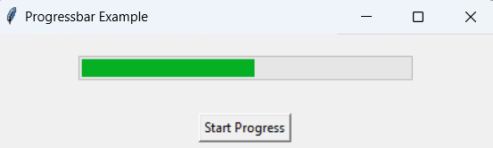
Example: This example simulates a task by gradually filling the progress bar from 0% to 100% when a button is clicked.
Python
importtkinterastkfromtkinterimportttkimporttimedefstart_progress():progress.start()# Simulate a task that takes time to completeforiinrange(101):# Simulate some worktime.sleep(0.05)progress['value']=i# Update the GUIroot.update_idletasks()progress.stop()root=tk.Tk()root.title("Progressbar Example")# Create a progressbar widgetprogress=ttk.Progressbar(root,orient="horizontal",length=300,mode="determinate")progress.pack(pady=20)# Button to start progressstart_button=tk.Button(root,text="Start Progress",command=start_progress)start_button.pack(pady=10)root.mainloop()
Output:
A progress bar gradually fills from 0% to 100% when the button is clicked.
15. SpinBox
The Spinbox widget is an enhanced Entry widget that allows users to select a value from a fixed range using up and down arrows. Below is the syntax:
spinbox = Spinbox(master, option=value)
Example: This example creates a Spinbox that allows selecting numbers from 0 to 10.
A window appears with resizable panes that the user can adjust by dragging.
Explanation:
PanedWindow(): Creates a resizable container.
add(): Adds widgets to panes.
orient: Controls horizontal or vertical layout.
Allows flexible and adjustable UI layouts.
Color Option in Tkinter
Tkinter widgets support various color options that allow you to customize their appearance, including:
Background (bg) and Foreground (fg) colors
Active background (activebackground) and active foreground (activeforeground) colors for buttons
Selection colors for input fields
This example demonstrates different color options applied to Button, Label and Entry widgets.
Python
importtkinterastkroot=tk.Tk()root.title("Color Options in Tkinter")# Create a button with active background and foreground colorsbutton=tk.Button(root,text="Click Me",activebackground="blue",activeforeground="white")button.pack()# Create a label with background and foreground colorslabel=tk.Label(root,text="Hello, Tkinter!",bg="lightgray",fg="black")label.pack()# Create an Entry widget with selection colorsentry=tk.Entry(root,selectbackground="lightblue",selectforeground="black")entry.pack()root.mainloop()
Output
Explanation:
bg / fg: Sets default background and text color.
activebackground/activeforeground: Colors applied when the button is pressed.
selectbackground/selectforeground: Colors for text selection in Entry or Text widgets.
Tkinter provides geometry managers to control how widgets are arranged inside a window. The three main geometry managers are:
1. pack() method
The pack() method places widgets in blocks. One can control their position and whether they expand to fill the available space.
Python
importtkinterastkroot=tk.Tk()root.title("Pack Example")# Create three buttonsbutton1=tk.Button(root,text="Button 1")button2=tk.Button(root,text="Button 2")button3=tk.Button(root,text="Button 3")# Pack the buttons verticallybutton1.pack()button2.pack()button3.pack()root.mainloop()
Output
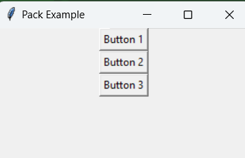
Three buttons arranged vertically in the window.
2. grid() method
The grid() method arranges widgets in a grid of rows and columns. Widgets can span multiple rows or columns using rowspan and columnspan.
Python
importtkinterastkroot=tk.Tk()root.title("Grid Example")# Create three labelslabel1=tk.Label(root,text="Label 1")label2=tk.Label(root,text="Label 2")label3=tk.Label(root,text="Label 3")# Grid the labels in a 2x2 gridlabel1.grid(row=0,column=0)label2.grid(row=0,column=1)label3.grid(row=1,column=0,columnspan=2)root.mainloop()
Output
Labels arranged in a table-like layout, with the third label spanning two columns.
3. place() method
The place() method positions widgets at specific x and y coordinates. You can specify absolute or relative positions.
Python
importtkinterastkroot=tk.Tk()root.title("Place Example")# Create a labellabel=tk.Label(root,text="Label")# Place the label at specific coordinateslabel.place(x=50,y=50)root.mainloop()
Output
A label appears at coordinates (50, 50) inside the window.
Event Handling in Tkinter
In Tkinter, events are actions that occur when a user interacts with the GUI, such as pressing a key, clicking a mouse button or resizing a window. Event handling allows us to define how our application should respond to these interactions.
Events and Bindings
Events in Tkinter are captured and managed using a mechanism called bindings. A binding links an event to a callback function (also known as an event handler) that is called when the event occurs.Below is the syntax:
widget.bind(event, handler)
widget: The Tkinter widget you want to bind the event to.
event: A string that specifies the type of event (e.g., <Button-1> for a left mouse click).
handler: The callback function that will be executed when the event occurs.
Key and Mouse Events
Key events are triggered when a user presses a key on the keyboard. Mouse events are triggered by mouse actions, such as clicking or moving the mouse.
Python
importtkinterastkdefon_key_press(event):print(f"Key pressed: {event.keysym}")defon_left_click(event):print(f"Left click at ({event.x}, {event.y})")defon_right_click(event):print(f"Right click at ({event.x}, {event.y})")defon_mouse_motion(event):print(f"Mouse moved to ({event.x}, {event.y})")root=tk.Tk()root.title("Advanced Event Handling Example")root.bind("<KeyPress>",on_key_press)root.bind("<Button-1>",on_left_click)root.bind("<Button-3>",on_right_click)root.bind("<Motion>",on_mouse_motion)root.mainloop()
Output
Mouse moved to (182, 41) Mouse moved to (141, 20) Mouse moved to (134, 17) Mouse moved to (128, 15) Mouse moved to (125, 13) Mouse moved to (122, 12) Mouse moved to (120, 12) Mouse moved to (119, 12) Mouse moved to (117, 14) Mouse moved to (117, 18)
Explanation:
The on_mouse_motion function is called whenever the mouse moves in the window.
Multiple event types can be handled at the same time.
Event Object
The event object is passed to the callback function when an event occurs. It contains useful information about the event, such as:
event.keysym: The key symbol (e.g., 'a', 'Enter').
event.x and event.y: The x and y coordinates of the mouse event.
event.widget: The widget that triggered the event.
You are visitor 01402503 — GeezerVison does not store the pages you look up. Best viewed with Netscape Navigator 4.7 or Internet Explorer 6 at 800×600. No cookies required.