GV

GeezerVison

The World Wide Web, restored to 800 pixels of glory.

Home|About|Gaming cabinet|Archives|How it works|Starter sites

On this site

  • All
  • Best
  • Libs
  • Learn

This view

  • Original page
  • New address

GeezerVison is showing python-graph-gallery.com — Introduction to scatterplot with plotnine

Introduction to scatterplot with plotnine

logo of a chart:ScatterPlot

Plotnine is a Python library allowing to create beautiful ggplot-like plots using the grammar of graphics syntax.

In this step-by-step post, we will see how to create a scatter plot using plotnine and how to add basic customization

Scatterplot sectionAbout this chart

Libraries

For creating this chart, we will need to load the following libraries:

  • pandas for data manipulation
  • plotnine for data visualization
import pandas as pd
from plotnine import *

Dataset

Since scatter plot is a type of chart that displays values for two numerical variables for a set of data, we will load the iris dataset.

The iris dataset is a classic dataset that contains the sepal and petal length and width of 150 iris flowers of three different species: setosa, versicolor, and virginica. In our case, we can to plot the sepal length on the x-axis and the sepal width on the y-axis. You can learn more about scatter plots by reading this section of the Python Graph Gallery.

url = 'https://raw.githubusercontent.com/holtzy/The-Python-Graph-Gallery/master/static/data/iris.csv'
df = pd.read_csv(url)

Most simple scatter plot

The only difference of plotnine compared to ggplot2 is that you have to wrap your code around parenthesis. Here is the most simple scatter plot you can do with plotnine:
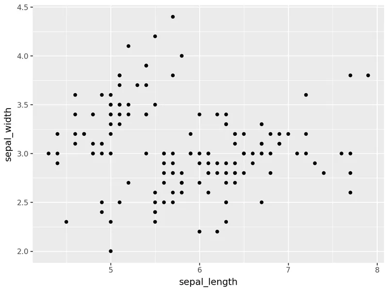
Introduction to scatterplot with plotnine: Most simple scatter plot

(
ggplot(df, aes(x='sepal_length', y='sepal_width')) +
    geom_point()
)
Dataviz caveat card: Beware of overplotting

⚠️ Avoid the 61 most common dataviz mistakes

The dataviz caveats I see the most, as a deck of 61 cards: a chart that is not ideal, and a better alternative. Free.

I respect your privacy. Unsubscribe anytime.

Custom colors

If you add the color argument inside the geom_point() function, you can change the default color of the points:
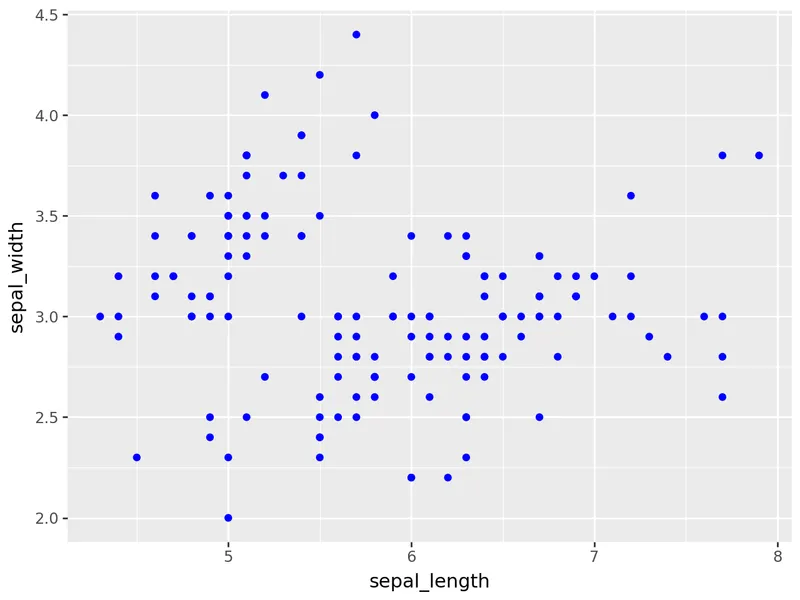
Introduction to scatterplot with plotnine: Custom colors

(
ggplot(df, aes(x='sepal_length', y='sepal_width')) +
    geom_point(color='blue')
)

Color by group

If you want to color the points by a specific group, you just have to add color='species' inside the aes() function:
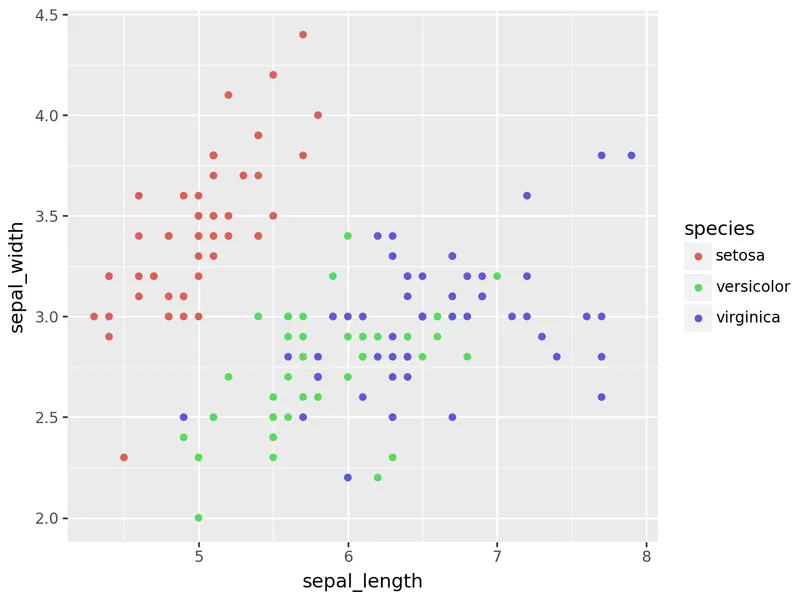
Introduction to scatterplot with plotnine: Color by group

(
ggplot(df, aes(x='sepal_length', y='sepal_width', color='species')) +
    geom_point()
)

Going further

This article explains how to create a scatter plot with plotnine.

If you want to go further, you can also learn how to custom markers in a scatter plot or how to custom theme.
Related posts

Custom markers in a scatter plot with plotnine

Custom markers in a scatter plot with plotnine

Custom theme with plotnine

Custom theme with plotnine

Marginal Plot with Seaborn

Marginal Plot with Seaborn

How to create advanced annotations in Matplotlib

How to create advanced annotations in Matplotlib

How to customise annotations in Matplotlib

How to customise annotations in Matplotlib

How to customize titles in Matplotlib

How to customize titles in Matplotlib

Related chart types

logo of a chart:ScatterPlot

Scatterplot

logo of a chart:Heatmap

Heatmap

logo of a chart:Correlogram

Correlogram

logo of a chart:BubblePlot

Bubble

logo of a chart:ScatterConnected

Connected Scatter

logo of a chart:2dDensity

2D Density

300 projects

💡 Out of dataviz inspiration?

I have spent years collecting the most beautiful data visualizations out there. Get the list of my top 300 dataviz projects, hand-picked, for free.

I respect your privacy. Unsubscribe anytime.

You are visitor 01402503 — GeezerVison does not store the pages you look up.
Best viewed with Netscape Navigator 4.7 or Internet Explorer 6 at 800×600. No cookies required.