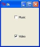
| Sr.No. |
Option & Description |
| 1 |
Activebackground Background color when the checkbutton is under the cursor. |
| 2 |
Activeforeground Foreground color when the checkbutton is under the cursor. |
| 3 |
Bg The normal background color displayed behind the label and indicator. |
| 4 |
Bitmap To display a monochrome image on a button. |
| 5 |
Bd The size of the border around the indicator. Default is 2 pixels. |
| 6 |
Command A procedure to be called every time the user changes the state of this checkbutton. |
| 7 |
Cursor If you set this option to a cursor name (arrow, dot etc.), the mouse cursor will change to that pattern when it is over the checkbutton. |
| 8 |
disabledforeground The foreground color used to render the text of a disabled checkbutton. The default is a stippled version of the default foreground color. |
| 9 |
Font The font used for the text. |
| 10 |
Fg The color used to render the text. |
| 11 |
Height The number of lines of text on the checkbutton. Default is 1. |
| 12 |
Highlightcolor The color of the focus highlight when the checkbutton has the focus. |
| 13 |
Image To display a graphic image on the button. |
| 14 |
Justify If the text contains multiple lines, this option controls how the text is justified: CENTER, LEFT, or RIGHT. |
| 15 |
Offvalue Normally, a checkbutton's associated control variable will be set to 0 when it is cleared (off). You can supply an alternate value for the off state by setting offvalue to that value. |
| 16 |
Onvalue Normally, a checkbutton's associated control variable will be set to 1 when it is set (on). You can supply an alternate value for the on state by setting onvalue to that value. |
| 17 |
Padx How much space to leave to the left and right of the checkbutton and text. Default is 1 pixel. |
| 18 |
Pady How much space to leave above and below the checkbutton and text. Default is 1 pixel. |
| 19 |
Relief With the default value, relief=FLAT, the checkbutton does not stand out from its background. You may set this option to any of the other styles. |
| 20 |
Selectcolor The color of the checkbutton when it is set. Default is selectcolor="red". |
| 21 |
Selectimage If you set this option to an image, that image will appear in the checkbutton when it is set. |
| 22 |
State The default is state=NORMAL, but you can use state=DISABLED to gray out the control and make it unresponsive. If the cursor is currently over the checkbutton, the state is ACTIVE. |
| 23 |
Text The label displayed next to the checkbutton. Use newlines ("\n") to display multiple lines of text. |
| 24 |
Underline With the default value of -1, none of the characters of the text label are underlined. Set this option to the index of a character in the text (counting from zero) to underline that character. |
| 25 |
Variable The control variable that tracks the current state of the checkbutton. Normally this variable is an IntVar, and 0 means cleared and 1 means set, but see the offvalue and onvalue options above. |
| 26 |
Width The default width of a checkbutton is determined by the size of the displayed image or text. You can set this option to a number of characters and the checkbutton will always have room for that
many characters. |
| 27 |
Wraplength Normally, lines are not wrapped. You can set this option to a number of characters and all lines will be broken into pieces no longer than that number. |